The future of custom
clothing made easy
Project overview
UniqueFit is a Hyderabad-based startup working in the field of clothing and fashion accessories for men. UniqueFit wants to solve the problem of finding the perfect clothing that every man desire.
My role
Lead UX UI Designer | Maxc studio
User research, Information architecture, wireframing, visual design & usability testing.
Duration
Jun-Oct 2021,
(9 months)
Client

Intro
Project overview
Finding best clothes that fit to us is the most difficult thing to find out one's. Being in the world of commerce and other online platforms it made people very hard to choose the right clothes for them. Most of the clothes are made and designed for people all across the world which shows international brands using universal sizes. But the fact is that one size doesn't fits all. Different people across the world follows different cultures eat different food and live in different climatic conditions. Physical appearance of people varies and related to the place and cultures people grow on. World is changing real quick and fashion industry is changing rapidly. It became hard for people to find their desired clothes. Today no one finding their perfect clothes.
So uniquefit has decided to launch products that people can customise in all the possible ways just how they desired. By building a platform that stays as communicative business medium with the users through which Uniquefit can offer high quality products at affordable prices so that users design their products to their desire.
Business goals
- The major goal of Uniquefit is to build a platform that offers a seamless experience for people so that people can customize their clothes online with a wide range of customizing options at affordable prices.
- To make custom clothing accessible for everyone.
- Uniquefit wants to reduce textile waste by making clothes that people love to wear.
Design process
In order to develop this particular product, we chose to use the Design Thinking approach to guide me through the process. By following the steps, we were able to research thoroughly about the fashion e-commerce industry before we proceeded to analyze the problem and ultimately come up with a solution.
Discover
User Research
Secondary research
With the outbreak of COVID-19 that forced all of us to stay inside, many turned to online shopping as a way to spend time. Because of this, online fashion retailers saw a dramatic increase in revenue during the pandemic. In fact. the fashion e-commerce industry accounted for approximately 20.5% up in sales(according to Statista) after the second pandemic. The majority of people are moving to the workspace. At this moment most people claimed that they are planning to purchase new clothes to meet their needs. But they are not to able pick clothes that suites them.
Online shopping makes it possible to purchase clothes with just a click of a button, it does entail numerous problems. Not only is it difficult to choose the product in the correct size, but there is also the possibility of going through the return process if the product does not fit properly. No one really enjoys this, especially during a time in which it is recommended that we take extra precautions about going outside. Taking all of these into consideration, we are in need of features that will help us find the perfect fit.
We have went through different E-Commerce fashion websites serving in India. We chose five different shirts from different brands (maybe one or two are from same brand) which were widely used by men in India or popular brands among people. Below are the reviews from people faces issues with the particular products when they purchased online. At the end, user has to be happy with what he is getting so we have to ignore reviews that users felt good about the product.
Most of these reviews say that they have fitting issues or product they have received looks different from the image they saw on the E-Commerce platform or description gave for the product is inaccurate or different brands following different measurement formats or receiving a damaged product from big brands was not acceptable.
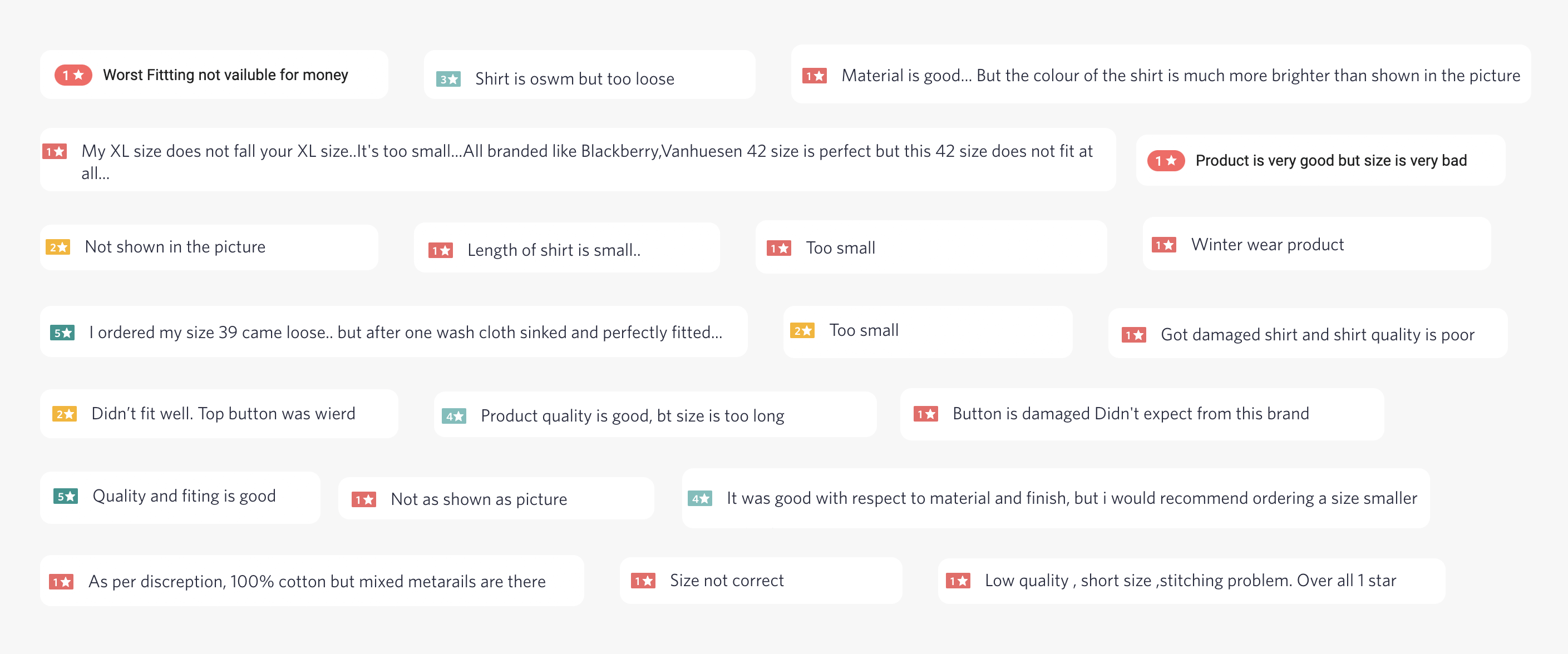
A snippet of few reviews by users on the products we have selected for research purposes.
Customers enjoy the ease of ordering clothes online from the comfort of their homes, but the frustration and the fear of getting deceived by the final style and look deter shoppers from exploring various styles and reduces the retailer’s revenue due to high return rates.
During the secondary research to have also found out that companies are more affected than the customer who is facing the problem with the product. To provide seamless journey for the user companies has to take the burden of costs associated with shipping and returning of products. All the products that are being returned by the users who have purchased from any commerce platform are being ended up in the warehouses also there produces a lot of material waste in the form of packages which needs to be recycled is picking up a big problem in the field of e-commerce.
We have come across a problem statement on internet, by a popular e-commerce platform in India is trying out for a solution which helps in reducing the rate of product returns back to the sellers without affecting the customers experience of purchasing a product. Below is the problem statement which the company has described in its own words.

We have found this snippet on the web. We took this into consideration to make a better process.
After collecting a lot of data from the desk research we were able to figure out a way on how to approach users, what kind of data we have to look into, and the preparation of right questions so that we learn more about users and their pain points during primary research.
Primary research
We have conducted user research on people from the age group of 16 to 50+ and references given to the people who are more familiar with online shopping. We have done the user research successfully by implementing different research techniques like online surveys and individual user interviews to learn more about users and their pain points with the online shopping experience.
Surveys
We have conducted online survey so that we can learn something from the quantitative data which would be really hard to to interview each individual user and ask same questions also reduces the accuracy. We have learnt few things about users and their behaviour with shopping online especially fashion products. We have prepared this set of questions so that both male and female could share their feedback which would be from different demographics. This helped us to learn more about how individual users feel about online shopping. Later we have filter out the required data from the survey which we have visualised to get results obtained properly. Below I have shared a snap of sample data which we have collected with the help online survey.
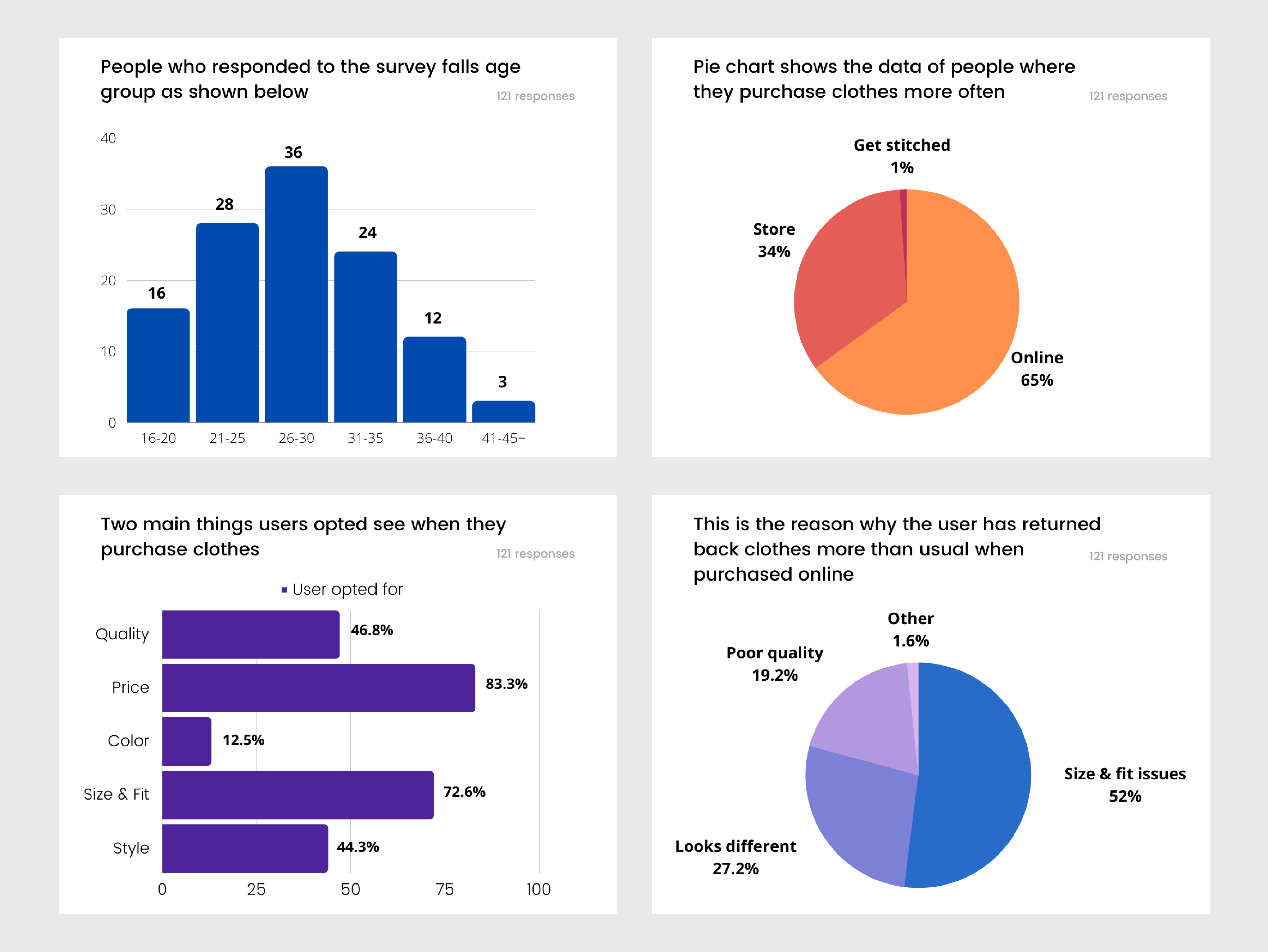
Snap of data collected from online survey.
User interviews
We have prepared a set of questions which acts as a reference so the interaction with the user doesn’t go in a weird way when interviewing users. We have prepared these questions in such a way that will be learning more things from the user in an interactive way by expressing their story and their pain points which they show me during this online journey. Experiences change from person to person so we have taken every user story the consideration.
we have prepared a set of questions for the user interviews. These questions allowed us to learn more about the user’s behavior and experience with clothes purchasing.
- What is your preferred method of shopping- online or in-store?
- Can you elaborate on why that is your preferred method?
- How long does it take for you to shop online?
- Do you think that you shop more/less because it is online?
- Which brand/website do you use the most to shop online?
- What is it about the brand that makes you go back to it?
- What are some features that you use when you shop online?
- What are some factors that you keep in mind when you shop online?
- Have you ever purchased something that you originally did not plan on because of the recommendations that the website offers?
- What is something that you find irritating about shopping online?
- Can you describe your most recent experience with shopping online?
- Can you describe what a positive online shopping experience would be like?
- Can you describe what a negative online shopping experience would be like?
- Do clothing brands actually matter to you?
- What brand fitting are you the most comfortable in? Would you choose any other fitting, if yes when?
- Do you think it is worth getting clothes tailored?
- What are the factors that are keeping you away from custom-tailored clothes?
- Would you like a stylist to design everything for you when you’re unsure what exactly you are looking for?
- Do you recommend brands/tailors you like to others? What motivates you to do so?
- What do you look for in a brand/tailor before deciding to buy?
we have prepared a set of questions for the user interviews. These questions allowed us to learn more about the user’s behavior and experience with clothes purchasing.
- I don’t give much importance to clothing until and unless there is an occasion on which I need to be present. Not the kind of person who purchases clothes very often. So I like to buy a good one.
- I prefer buying clothes online because I would be getting better prices compared to stores and I can see a wide variety of collections online.
- I buy clothes at stores because I give much importance to comfort where I can try and buy them.
- Most often I return back online purchased clothes due to fitting issues.
- I return clothes back to the online platform mostly due to the product being different from the image shown on the platform or the product has not met the description stated on the platform or didn’t reach my expectations.
- Few stores don’t accept clothes for alteration due to the brand guidelines. So I end up doing my alteration with a local tailor.
we have prepared a set of questions for the user interviews. These questions allowed us to learn more about the user’s behavior and experience with clothes purchasing.
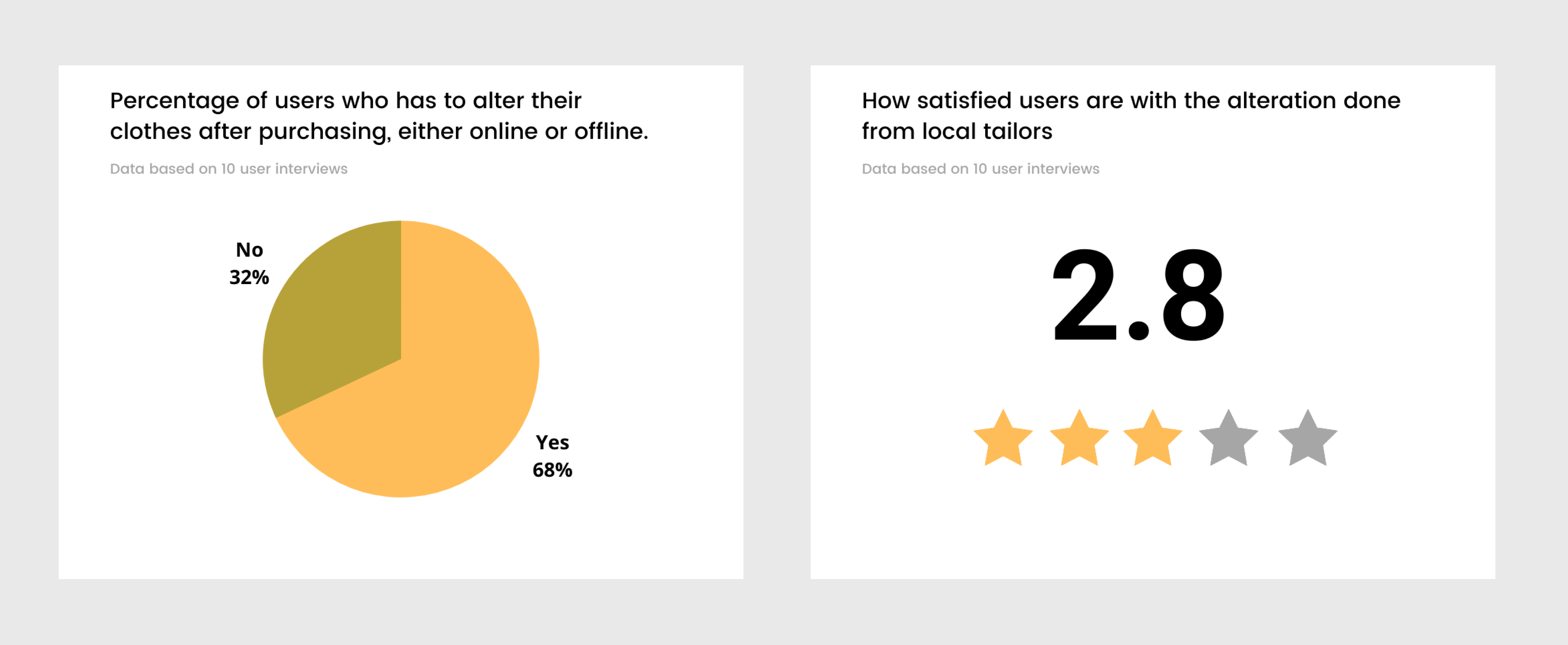
What individual categories think they are facing the biggest problems in journalism today?
Stakeholder interview
We have interacted with the stakeholders and business advisors of unique fit to learn more about what is possible and what is not in the textile industry. We have gone through a lot of conversations with Uniquefit advisors from the perspective of business. We were very glad that the stakeholders of Uniquefit spent enough time to provide a better product for the users during the research stage.
Competitive analysis
Once we were able to get a better understanding of the thoughts and feelings of the users, we proceeded to conduct research on some of the direct and indirect competitors. During the research, we wrote down some of the major strengths and weaknesses of each of the websites. Doing so made us learn more about the companies who are working on this problem to offer users a better experience with purchasing clothes online and it easier to figure out the commonly sought-after features for fashion e-commerce websites.
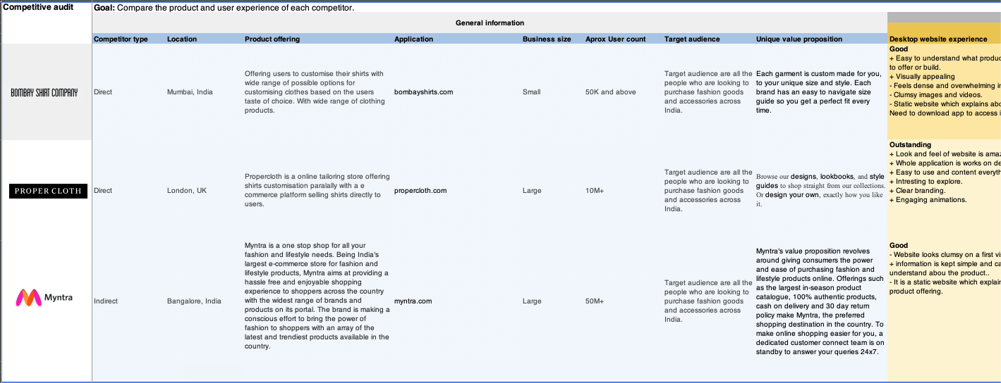
A snap of competitive analysis data is shown above.
A complete competitive audit report will be made available once the client launches the full product.
Define
Analysing data
Empathy map
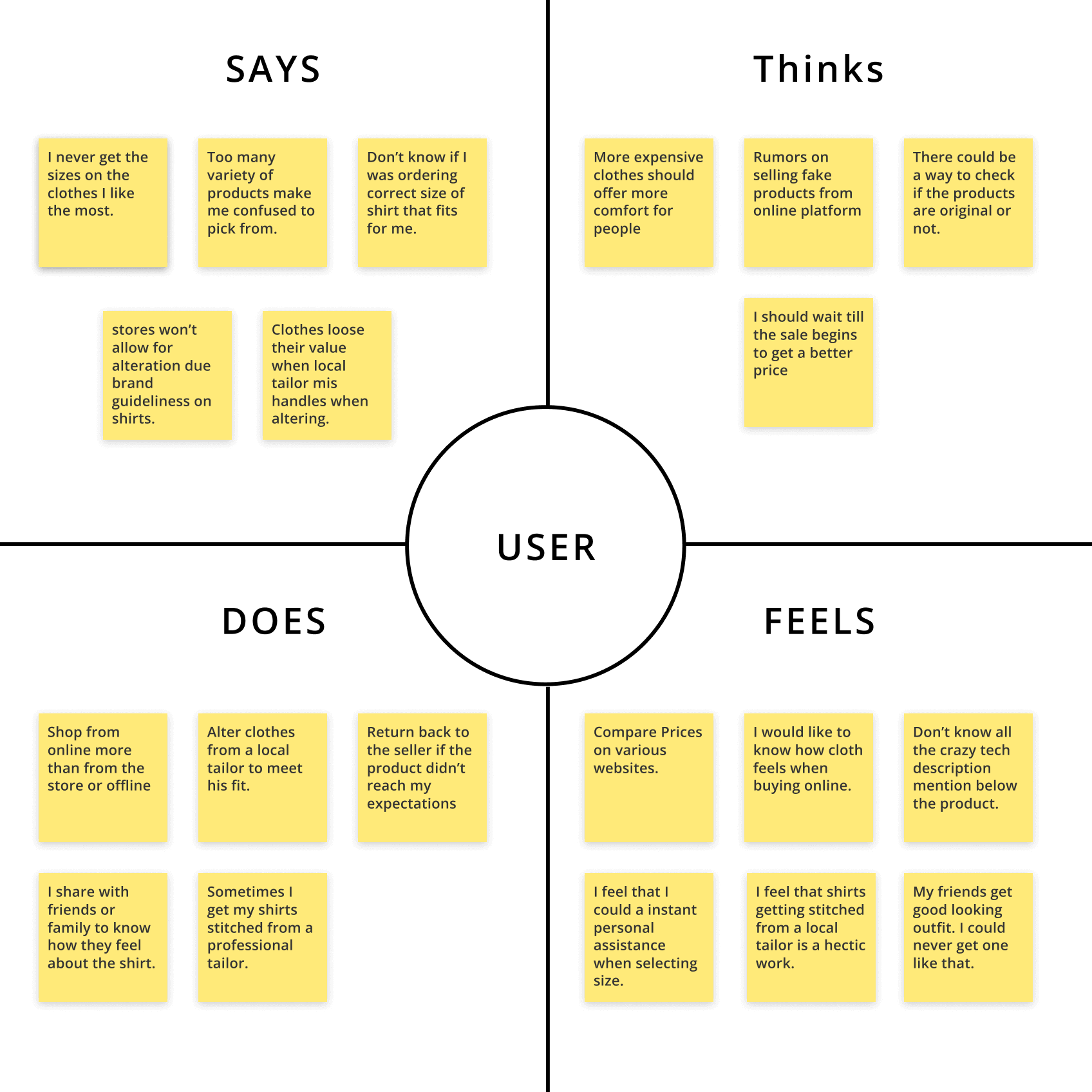
We started analyzing all the data, qualitative and quantitative, which we have gathered from both primary and secondary research. Based on user interviews we have segregated all the conversations into empathy mapping where the data is divided into four quadrants which represent what you say, what users think, what does user does, and what the user feels. For and better understanding user. With this empathy map, we were able to identify users’ goals and their pain points.
By analyzing this data we have moved on to the next step in the design process which is to define our users, identify their pain points and develop a problem statement.
User persona
The insights we have uncovered from both my primary and secondary research allowed us to create a user persona. These user personas represent the core users for the clients business.
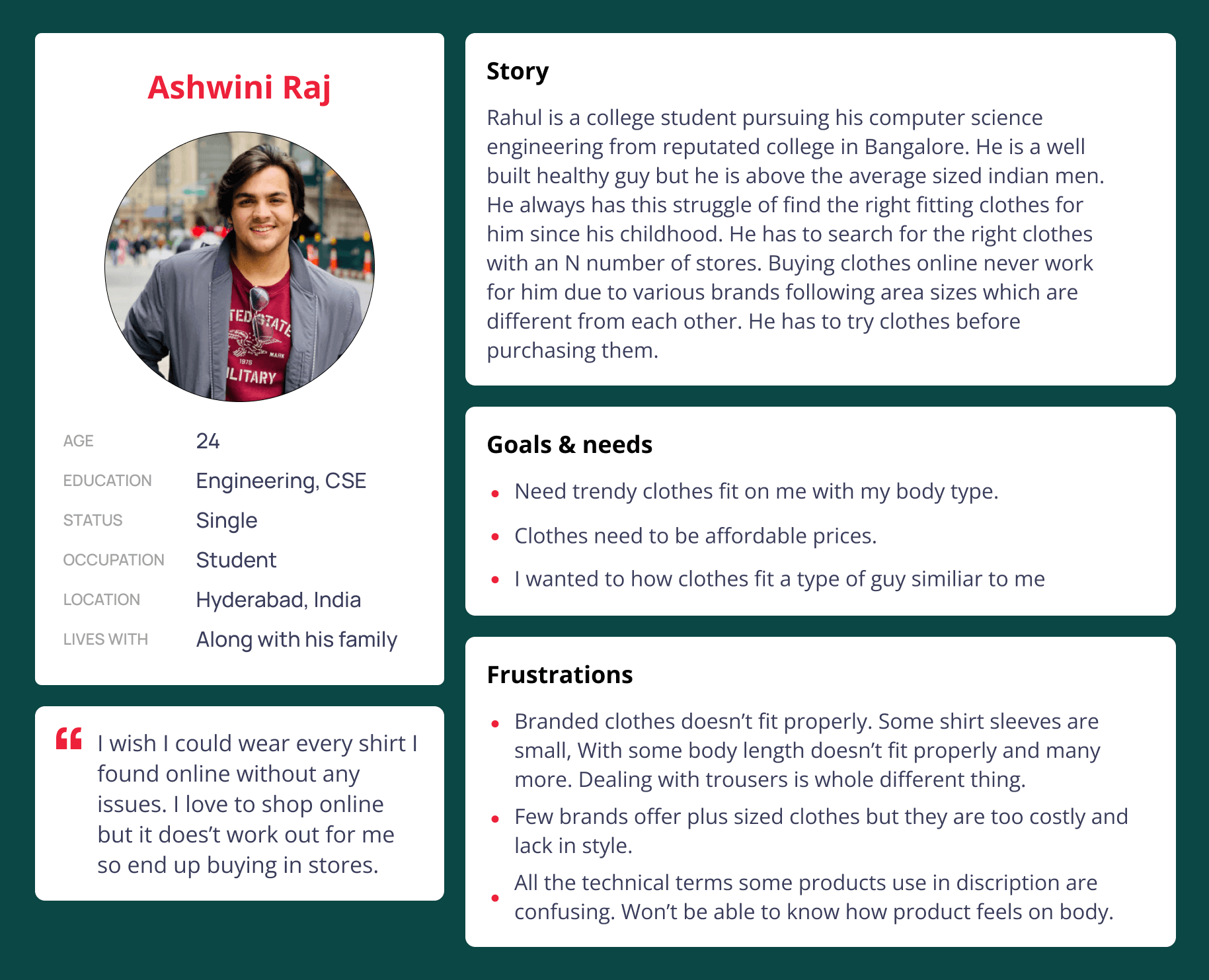
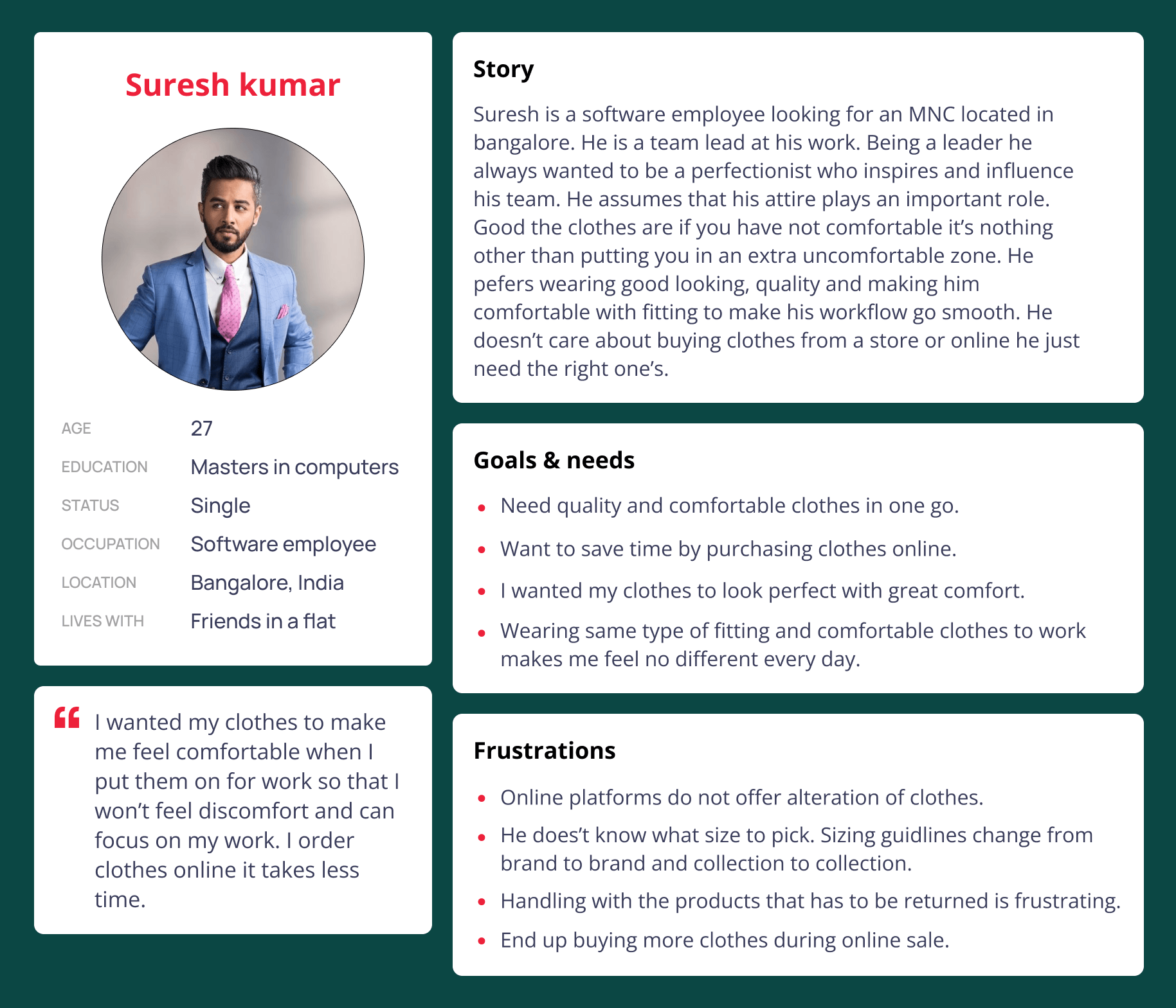
From the instructions and request from the client we are clear that we are solving the problems of the people at the highest priority rather focusing on the pain points of a business. So we have come up with two personas having different stories.
Persona 1
User story: Rahul is a college student pursuing his computer science engineering from a reputed college in Bangalore. He is a well-built healthy guy but he is above the average-sized Indian men.
He always has struggled to find the right fitting clothes for him since his childhood. He has to search for the right clothes with an N number of stores. Buying clothes online never works for him due to various brands following area sizes that are different from each other. He has to try clothes before purchasing them.
Persona 2
User story: Suresh is a software employee looking for an MNC located in Bangalore. He is a team lead at his work. Being a leader he always wanted to be a perfectionist who inspires and influences his team. He assumes that his attire plays an important role. Good, the clothes are if you have not comfortable it’s nothing other than putting you in an extra uncomfortable zone. He prefers wearing good-looking, quality, and making comfortable with fit to make his workflow go smoothly. He doesn’t care about buying clothes from a store or online he just needs the right ones.
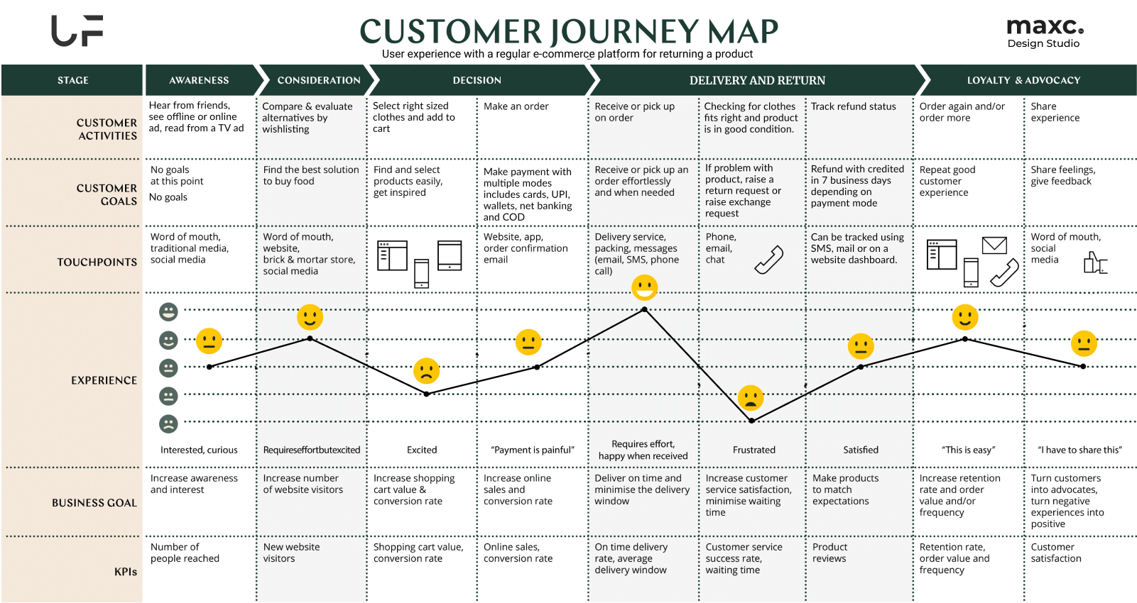
User journey map
User story: Suresh is a software employee looking for an MNC located in Bangalore. He is a team lead at his work. Being a leader he always wanted to be a perfectionist who inspires and influences his team. He assumes that his attire plays an important role. Good, the clothes are if you have not comfortable it’s nothing other than putting you in an extra uncomfortable zone. He prefers wearing good-looking, quality, and making comfortable with fit to make his workflow go smoothly. He doesn’t care about buying clothes from a store or online he just needs the right ones.
Synthesizing data
Problem statement

Hypothesis statement

Unique value proposition

Ideate
Crazy 8's
Crazy 8’s is a fast sketching exercise that challenges people to sketch eight distinct ideas in eight minutes. This is an ideation technique we have during the ideation stage of Uniquefit project.
We have identified design a customization dashboard for the mobile interface is going to be the difficult part. So we have used the crazy 8’s technique for more possible ideas. Following by crazy eights technique we were into brainstorming discussing ideas and other possibilities for creating a great user experience for the mobile dashboard.
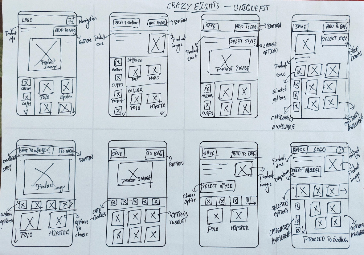
Picture of crazy 8's I have done during the process.
User task flow
With the problem statement in mind, we developed a task flow to show the ideal flow that the user would take to complete a task on Uniquefit website. In this particular case, it focused on finding and purchasing a product from the website. We have took a scenario in which user would have already signed up with the application. Working on this helped me identify the key screens for my design.
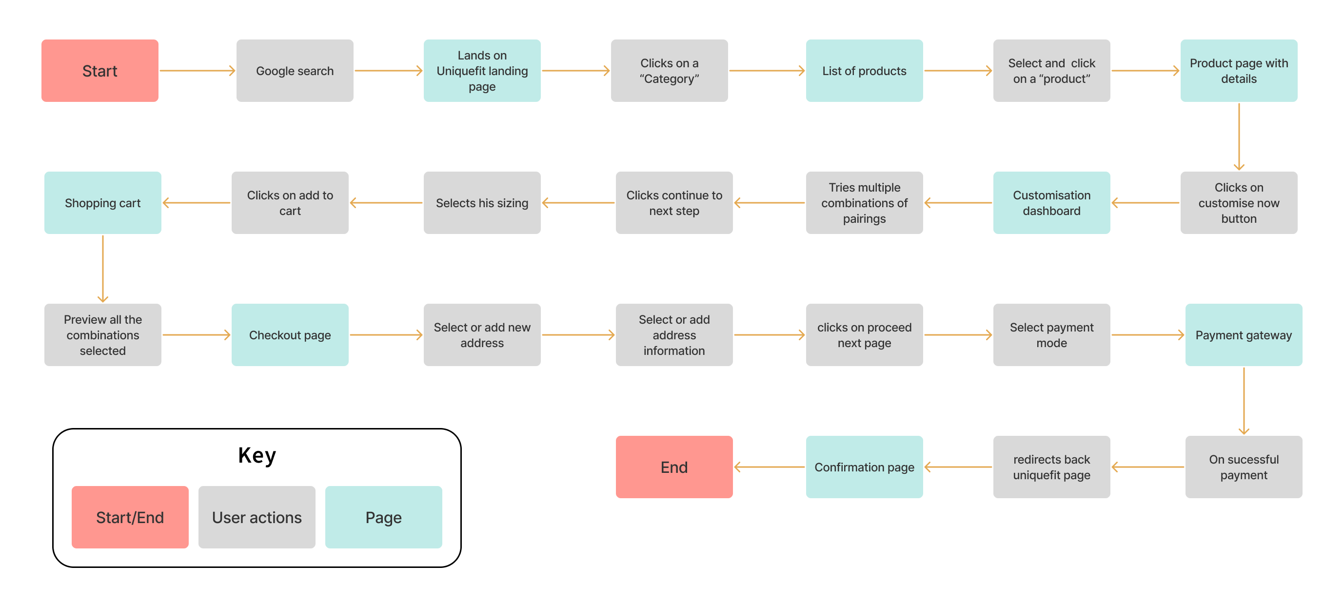
User flow
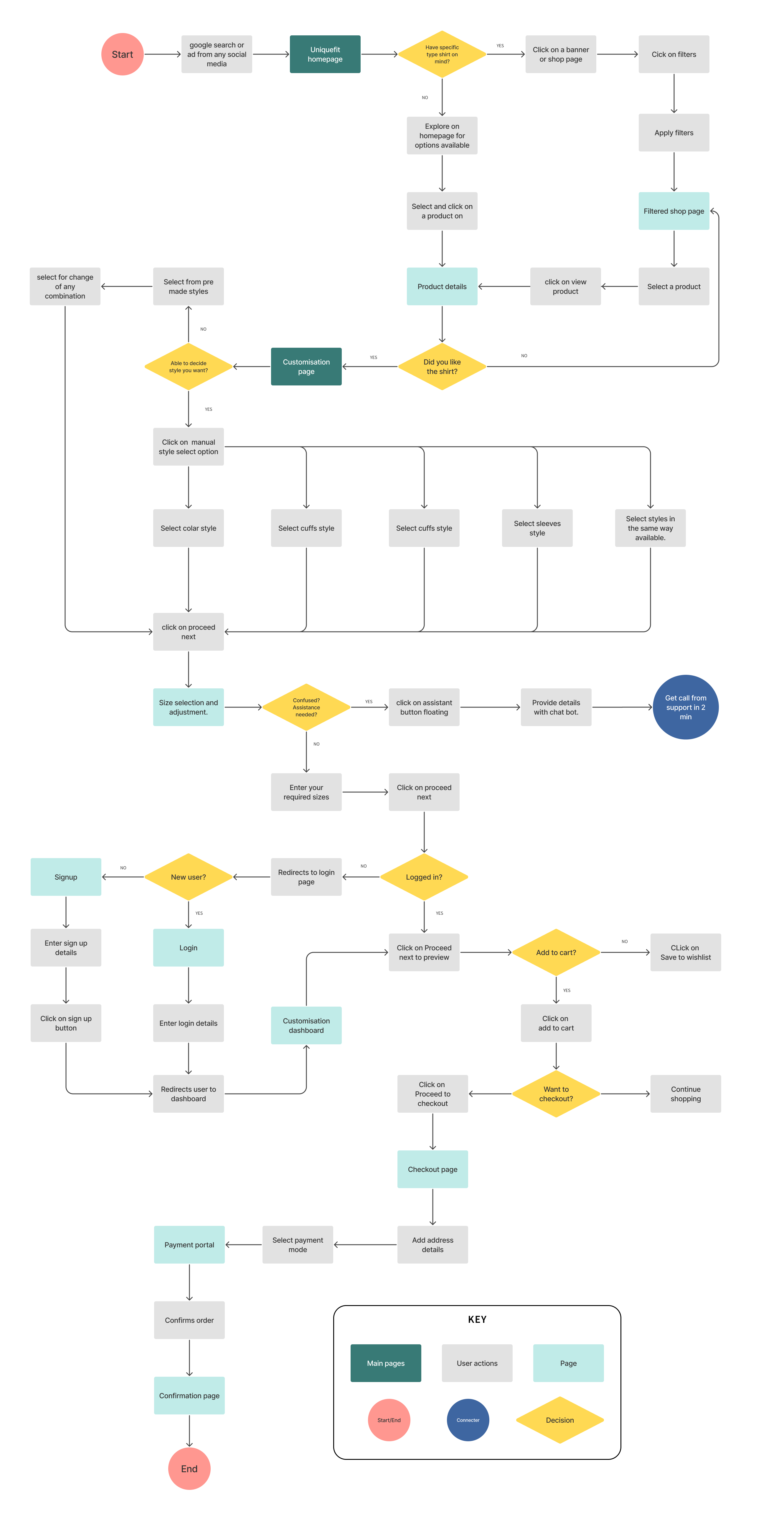
Once we have completed the task flow, we then proceeded to create a detailed user flow. This essentially illustrates the various paths that the user can take to complete a task. Creating this flow allowed me to think from the user’s perspective and consider the different options that the user has while using Uniquefit website.
Information architecture
Information architecture for an e-commerce application is a complex task. Adding information wisely to each page during the user flow through the application. We have designed the initial architecture which has little iterations along with the iterations that have occurred in the later processes. Designing this architecture helped us to keep in track of all the pages we have to work on.
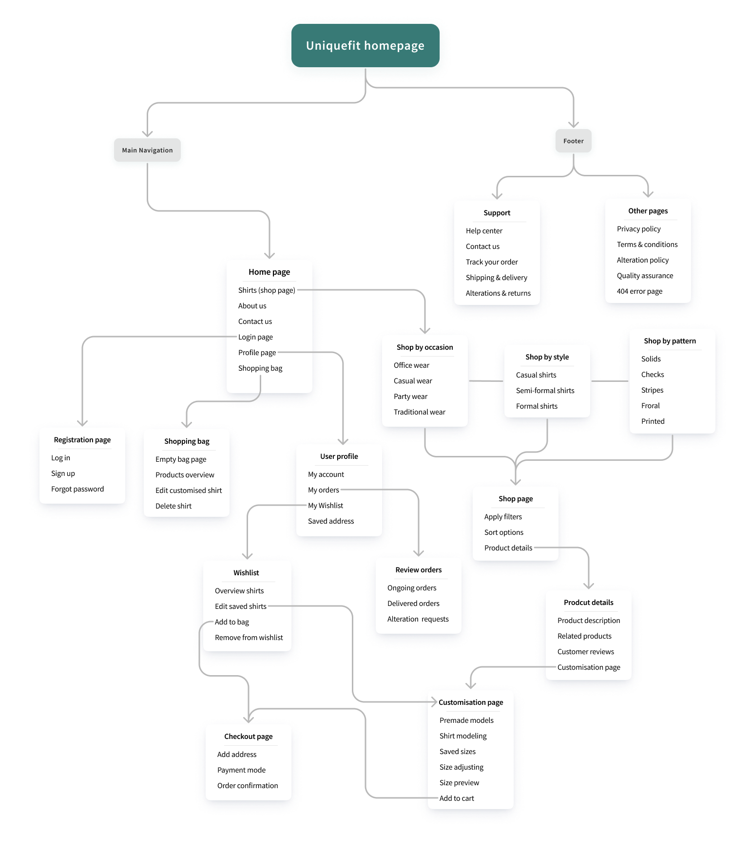
We have followed a mobile-first approach during uniquefit application designing.
Wireframing
Low-Fidelity wireframes
With the bunch of ideas, we explored as a team has come up with different wireframes representing the ideas we have come up with in the brainstorming session. We have tested as many ideas as possible and collected every possible feedback. Below are a few of the ideas we have worked on.
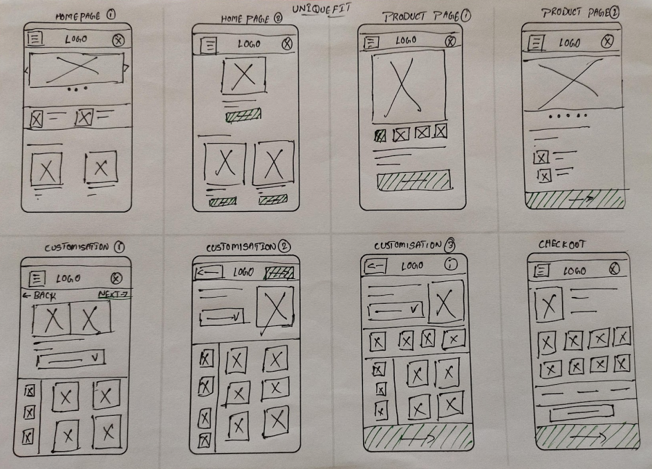
Mobile application paper wireframes are used for ideation and for better product designing.
Since we have followed mobile first approach we have given everything first priority for mobile followed by the web application. This made our work go really smooth. Working on all the requirements for a smaller screen gave us breath taking time when we were designing a larger screen.
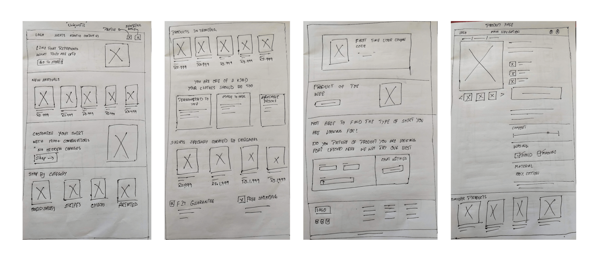
Above are the paper wireframes built for the web application.
Design
High-Fidelity wireframes
Secondary research gave us a valuable starting point, however I wanted to conduct primary user research to really delve into the daily work life of a freelancer.
For a deeper understanding of freelance needs and challenges, we recruited and conducted a user interview in order to learn about freelance attitudes towards, and management of, non-billable tasks. Because this interview presented a small, non-representative sample, I also conducted a user survey to collect additional data.
The goal of my research was to better understand the experience and feelings of freelancers when completing non-billable tasks. Key insights from my discovery research include:
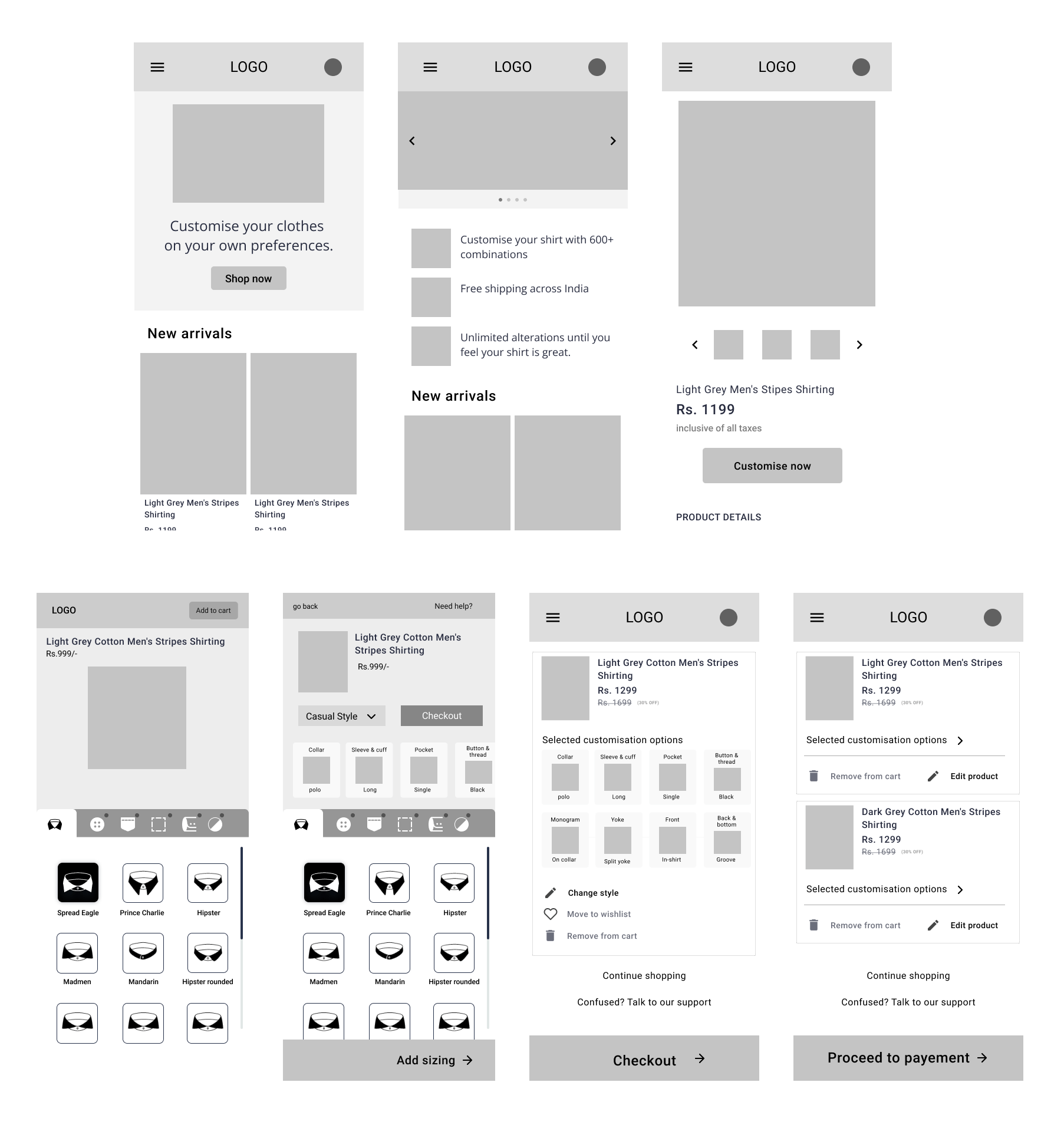
Customization tool for users
Here comes the important and difficult challenge for us which is designing user-friendly dashboards to customize their shirts. We have done a lot of research to understand how users are interacting and performing tasks on the competitor’s sites. We have collected a good amount of information to proceed further.
During this process we have designed a style customization layout below can be seen. Who have built this rough wireframe from the understanding of the business perspective and the story we heard from the stakeholders of uniquefit, for a better understanding of where we are heading to.
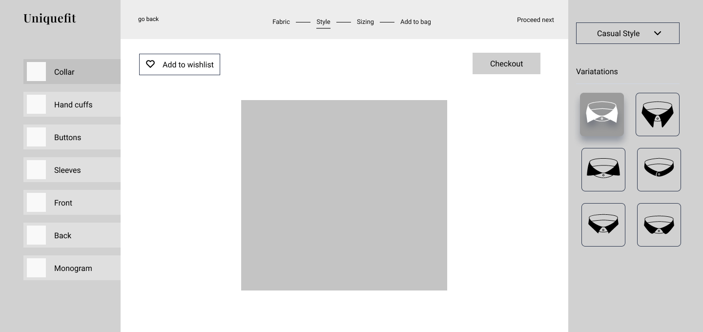
Above are the paper wireframes built for the web application.
We have designed and developed a high-fidelity prototype and tested it with a few people (which includes stakeholders, project managers, designers not working on the project, and developers) who can understand the technical side of the wireframes.
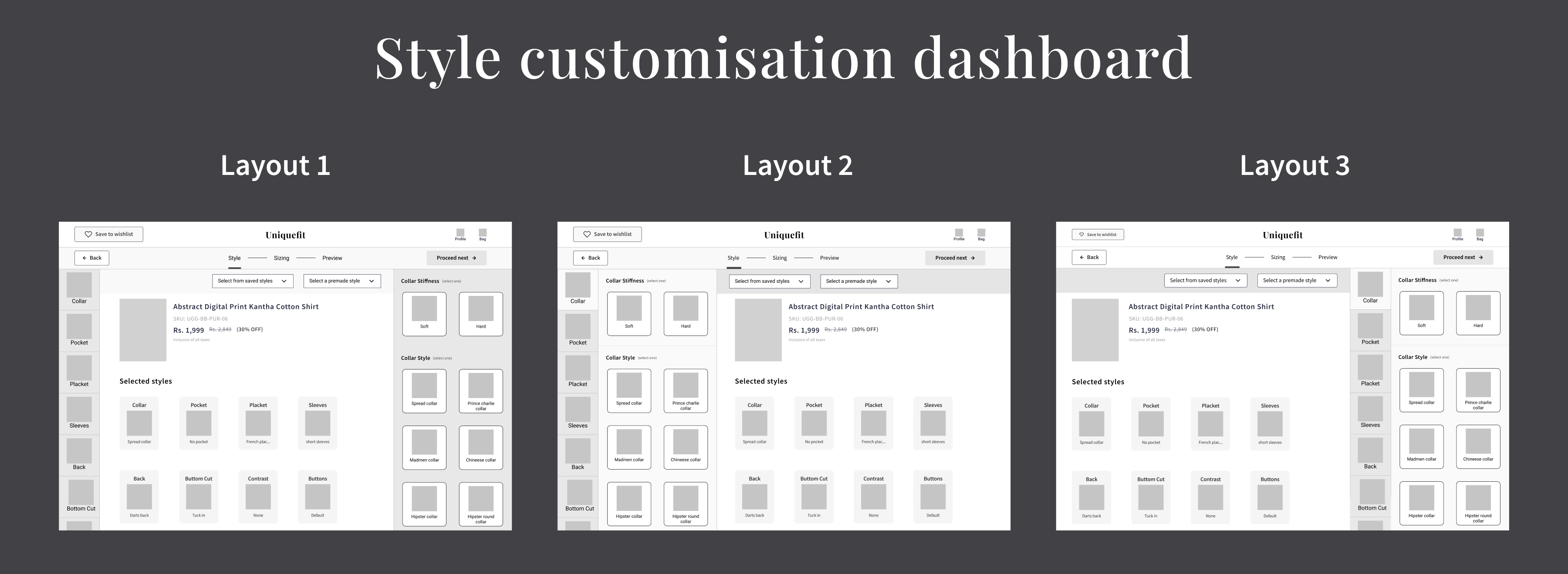
Later in this part, we observed users interacting with high-fidelity prototypes. During this stage, we felt that there was a lot of cognitive load on the users while going through the process of selecting the styles they desire. Which is making users get frustrated and exit the dashboard. We have also observed that users are confused and left in a state of not knowing what to do next.
We have a design plan to reduce cognitive load by showing the selections that users have selected between the style variations. We aren’t practically sure which customization layout would allow users to the maximum and best usable way. So, we decided to test out all three possible layouts by testing prototypes with the users.
Visual design
We have a design plan to reduce cognitive load by showing the selections that users have selected between the style variations. We aren’t practically sure which customization layout would allow users to the maximum and best usable way. So, we decided to test out all three possible layouts by testing prototypes with the users.

UI design & prototyping
We ideated in collaboration on what the new Information architecture of the platform should look like, ensuring that it is usable and scalable.
For proper hands-on collaboration and to provide real-time visibility of progress to the stakeholders we chose Figma as our design tool. All stakeholders were invited to that space, and feedback were taken from them. Figma was a lifesaver in this project as it enabled us to design things that were technologically feasible – since time was a constraint.
Complete usability testing was done at every stage. We employed the focus groups technique and user observation at each stage.
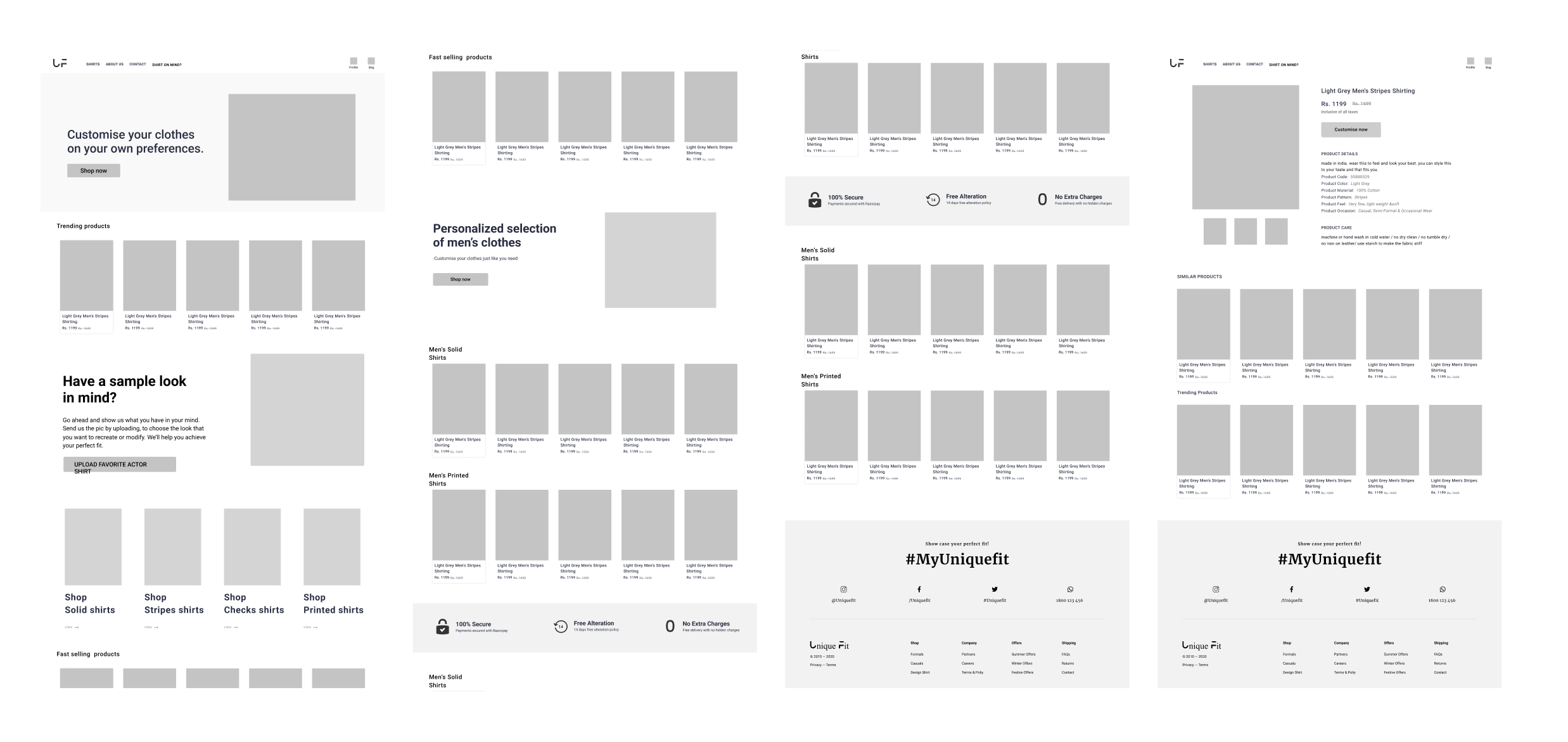
Web landing page and product page prototype
We tried to keep the platform as minimal as possible so that users feel easy to explore and reach their desired page or fulfill their task.
Providing a good user experience on the small screen is definitely a huge task for us. We have designed every small thing keeping mobile devices in mind. Mobile devices has reach to an extent that most of the users are trying to or performing their tasks on their mobile phone straight out of their pocket. We have also observed that our users preferred to explore the application through their mobile phones.
During the research I have asked other participants on which type of device they find new things or applications or what ever first talk. Majority of the people said that they find new things on their mobile first either in the form of social media post or through a text message from Friends and colleagues or casual web surfing. The thing people do when they find something new on their mobile is to check it out straight away on their mobile browser.
So the type of application we are designing now need a lot of good user experience on a mobile platform.
Mobile landing page and product page prototype
We took good care when designing mobile screens. We have conducted usability studies after designing every screen to make sure everything goes well for from the perspective of users. Readability and finding the right options quickly is our highest priority when designing for a mobile screen.
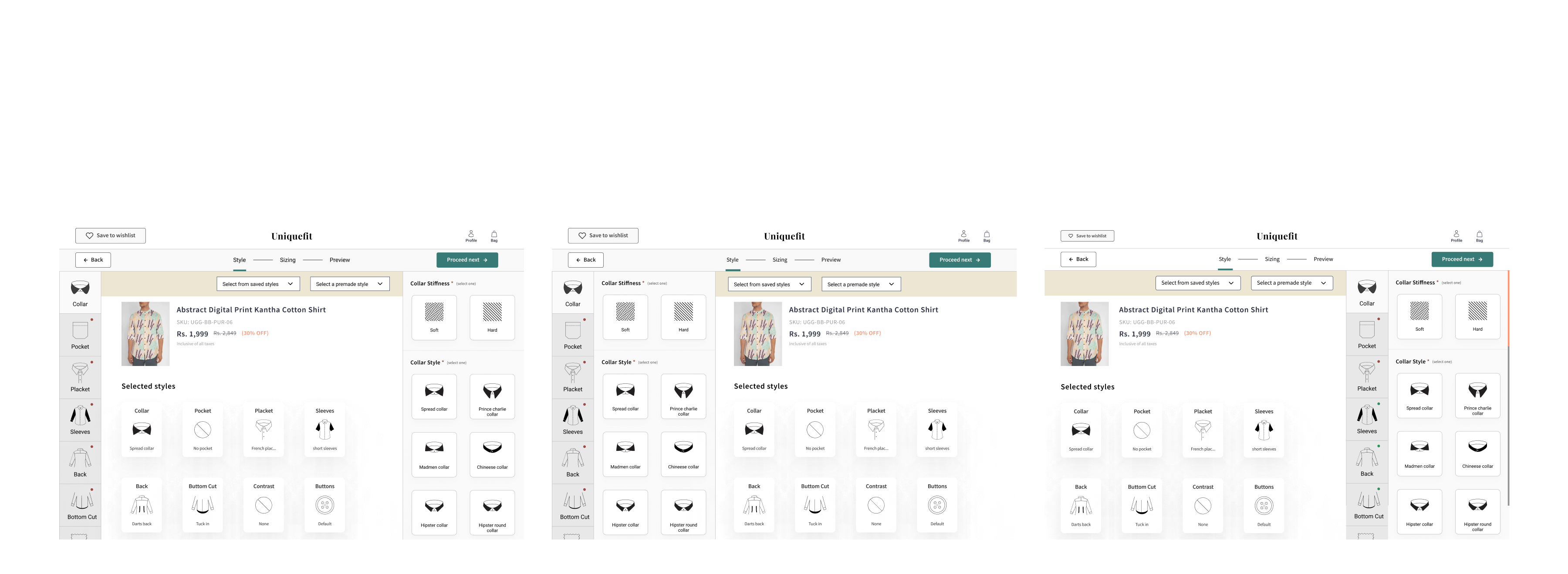
You have to design the complete UI of all three layouts of the style customization dashboard just like I have said to you during the high-fidelity wireframes of this above article. We have decided to pick one final layout by conducting a usability test and collecting user feedback.
This is something like leaving out the choice for the people. 😅
Usability testing
We have conducted an unmoderated remote usability study which lasted for four days. During this usability study, our highest priority was to learn more about how users interact with the customization dashboard. The customization dashboard is the complex structure in this application where different types of people will be using it which includes both technical and non-technical people in the sense of people who are new on the internet. Our main aim is to make this style customization dashboard as simple as possible for the user as well as to maintain a good conversion rate for the users.
During this usability study we have asked users to perform a set of tasks. While performing the assigned task we have calculated the time took by the user to perform the task, error rate, drop-off rate, conversion rate and at the end SUS followed by Net promoter score. We have recorded the whole session that has happened.
First let us finalise the customisation dashboard layout based on the results we have obtained from the study.
We have developed the above screens, which show the heat maps, user eye tracking, and repeated path to perform a task, based on our observations, studies, and feedback given by the participants from the usability study.
At the end, we have to pick layout-3 based on the studies, observations, and feedback from the user. We have seen that this one layout has a lesser error rate, less drop-off rate, and a high conversion rate.
Time taken for users to complete the task on the layout-3 is impressive. We think we have achieved because of the visual perception laws like the law of common region and the law of proximity is working really well.
But few technical people gave feedback that they are more comfortable with layout- 1. Here we have noted a saying in UX “What people actually say is not what they wanted“.
This is something like leaving out the choice for the people. 😅
cannot put the insights and metrics we have obtained ih the usability study.
Product page to style
customization dashboard prototype
We have kept our highest priority to help the users need their desired task with ease. We wanted to control drop-off rate, error rate and increase the conversion rate. So to provide assistance to people we made few changes to the dashboard after we have conducted the usability study.
Product page to style customization dashboard prototype
Who have tested out many designs to find out which one fits for the user. So we decided to design in this way so that miss touches can be avoided when user is trying to select a style. We have placed the CTA button at the top so that user may not hit the button by mistake. All the style options are placed with a one-hand accessible region.
Bag screen to checkout screen interactive prototype
Check out screen is a different kind of challenge for us. Users sometimes add the product to the bag or cart and come back later to purchase it. Users cannot remember all the options they have selected while customising a shirt. So, we have to show them a preview of selection of both style and size they have selected, option to preview and edit at checkout page.
Priority revisions
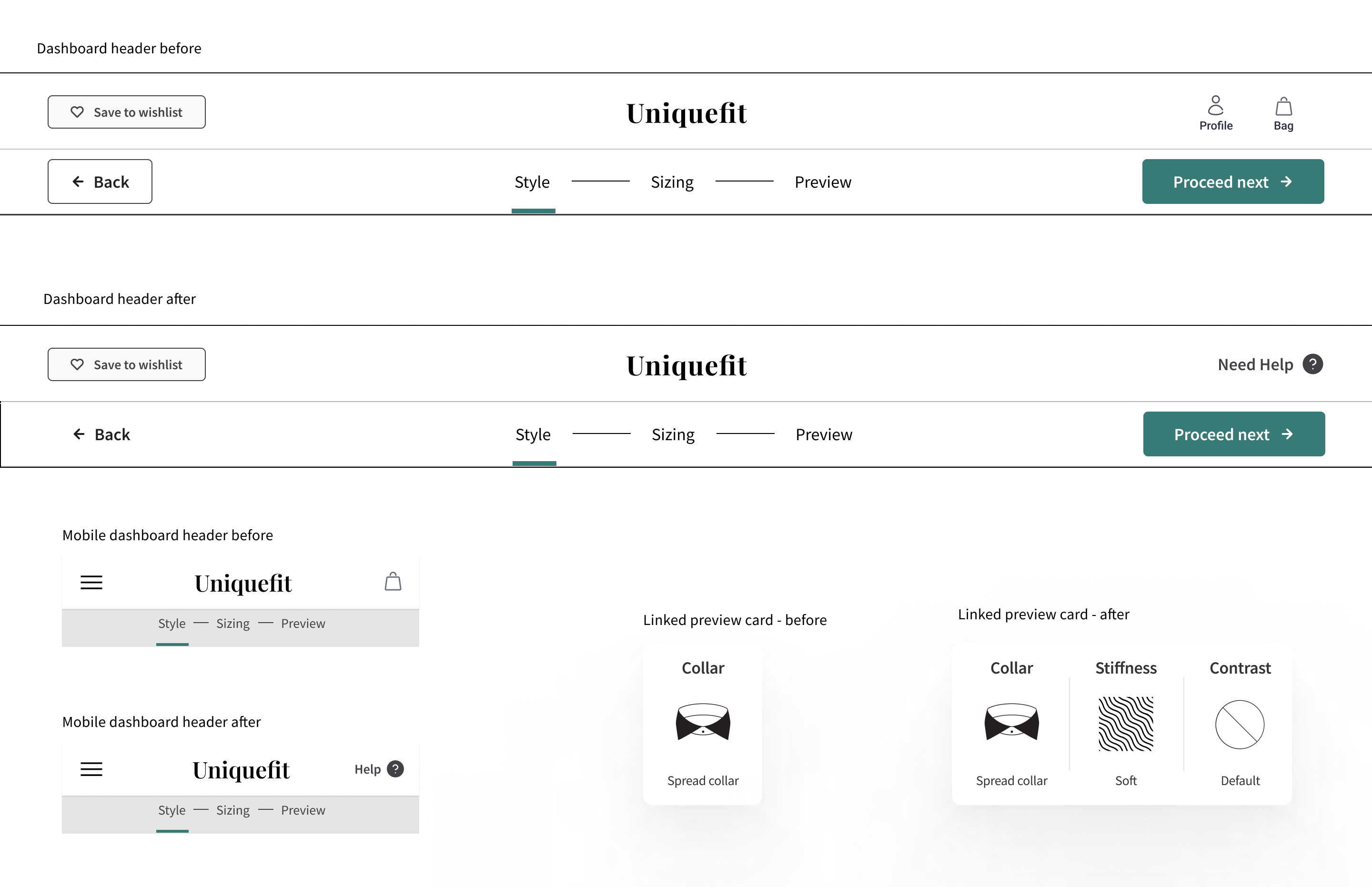
After a usability study, we have found users go missing or helpless during the process of customizing their shirts. So we have to design a customer support experience that can provide help to the user to make they should get right.
We have made changes to the dashboard of both web and mobile. We have to replace the profile and bag icons with help text and make a clear section at the left side of the head to make things more clearer to the user.
Developer Handoff
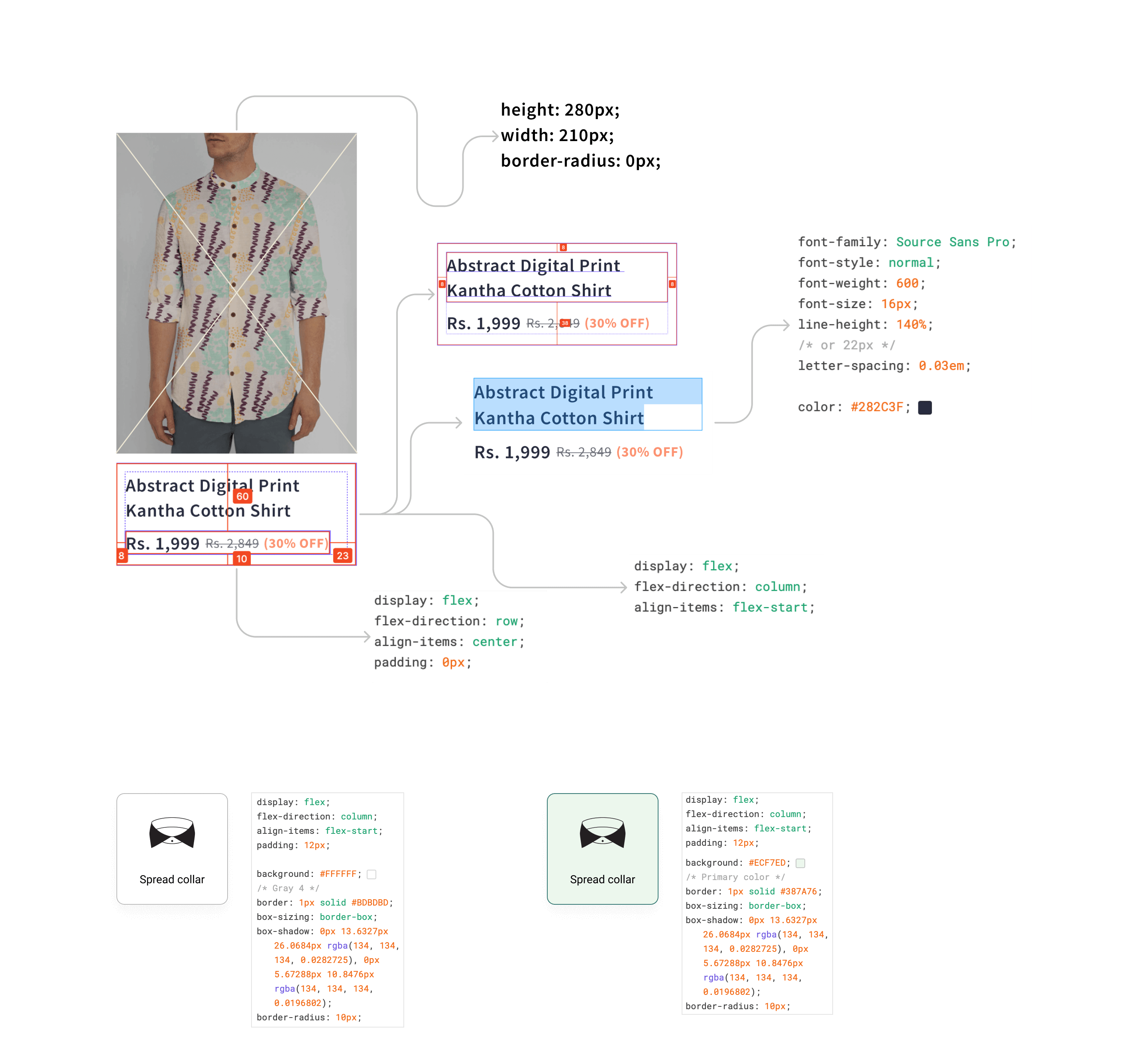
Once after all the process is done we have handed over the file to the developers and explain that tool and how to utilise the assets. I have also made a detailed documentation of the major components which are repeated across the application. Below is the sample documentation of the handoff file to the developers. We have trained developers with the Figma design file and using it. We have provided support to the developers for a certain period of time.
Disclaimer
This product is yet to be made accessible to general public. On my request client has accepted to publish this article and instructed me to not reveal sensitive information. Client and as well as Maxcreepers studio has verified this case study. Uniquefit team is happy to hear feedback from you. Please write to uniquefitindiaorg@gmail.com.
Thanks to Uniquefit CEO, Mr. Bharath kumar and Max studio team.
