How did it start?
I found Publix through the Senior Product Designer role. The public app already sorts a shopping list by aisle, so the obvious concept was off the table on day one.
The question became: what does a shopper still have to work out once the list is sorted?
The problem
A location-grouped list helps you find products. It may still leave you to decide what comes next and to remember what you skipped.
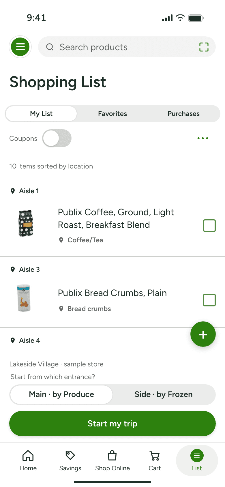
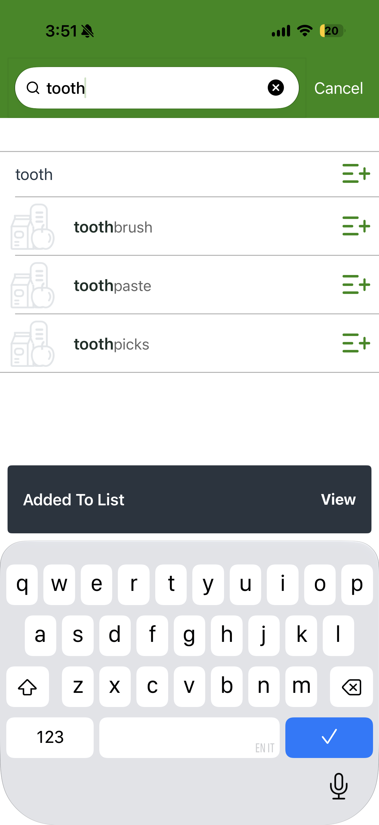
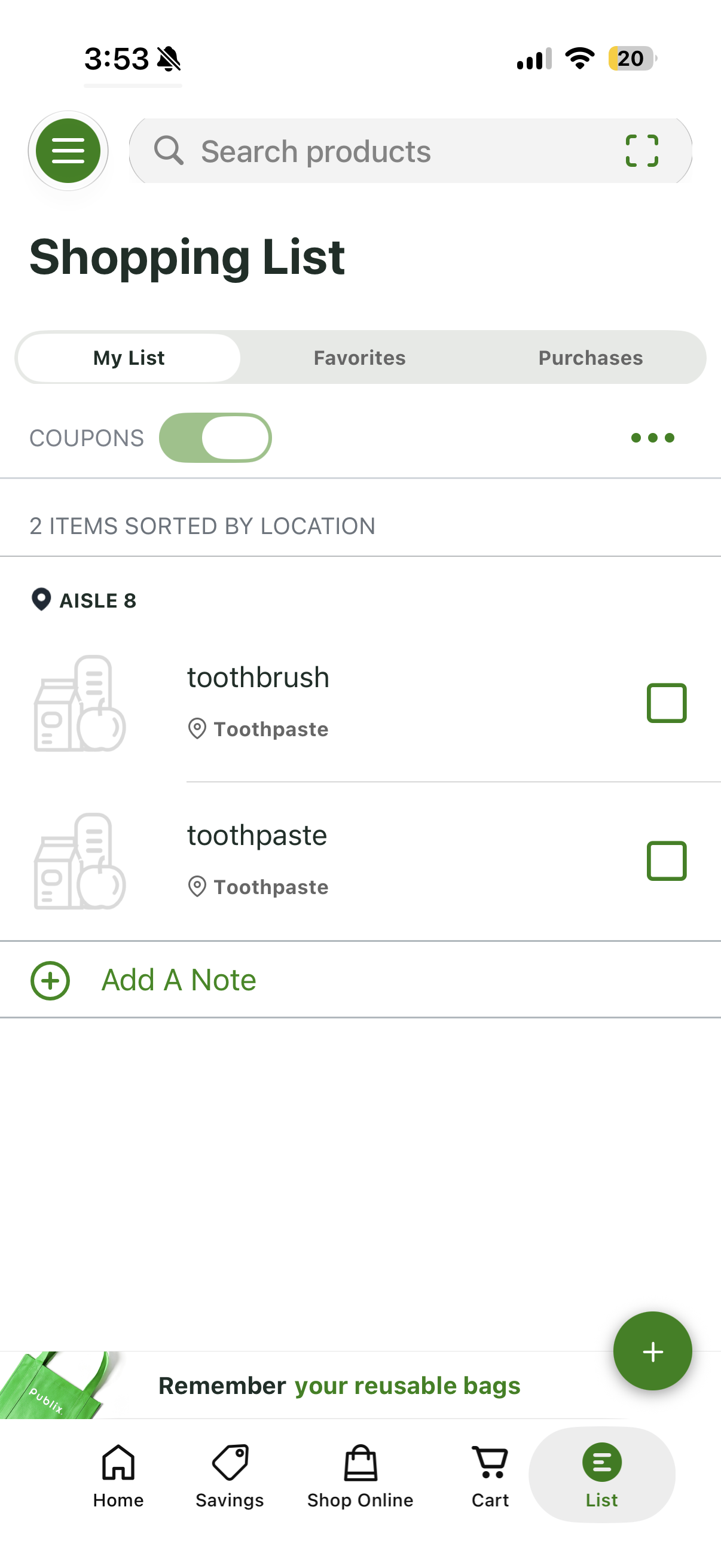
Publix groups items by aisle and area, with photos and check-off. [1][2] I kept those existing controls and focused the concept on the trip itself: the order you walk, the item you could not find, the one you passed.
Who is shopping?
Someone who built a list at home and is now standing in the store with it. Not a validated segment: a design target, chosen so the prototype has one job.
What Publix already does
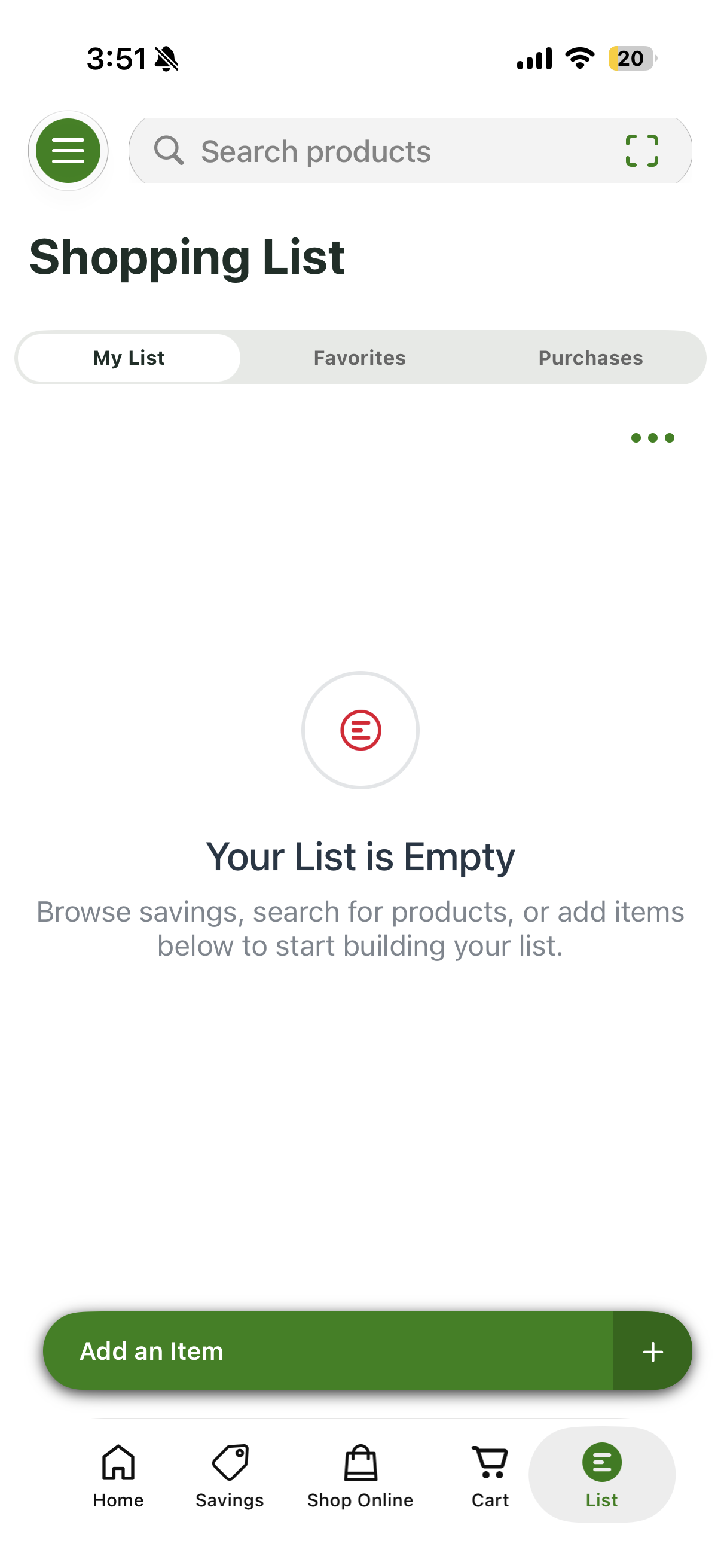
Publix’s public App Store captures show how shoppers build a list: open the empty list, search and add items, then return to location groups. I wanted to extend that workflow, not replace it.
What shoppers said
Selected public reviews shaped the brief. They raise questions about sequence and recovery; they do not establish how common these problems are among Publix customers.
How the evidence shaped the concept
I separated what the sources described from what I inferred, then used three priorities to choose the interaction.
Where the trip gets fuzzy
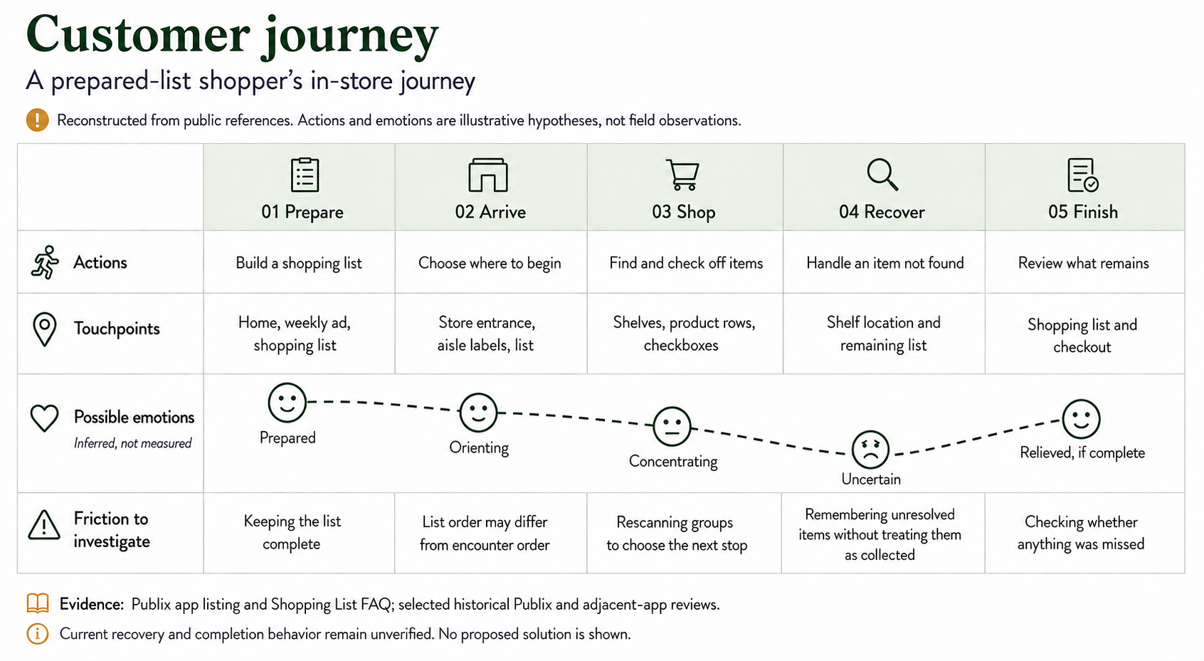
A location-grouped list may still require the shopper to translate display order into walking order and keep track of skipped items. The journey map makes those assumptions visible for testing.
My hypothesis
If the list can focus on one stop, suggest the next, and keep unresolved items visible, we expect shoppers to rescan less and recover more reliably than with the grouped list alone.
Four ways to turn a list into a trip
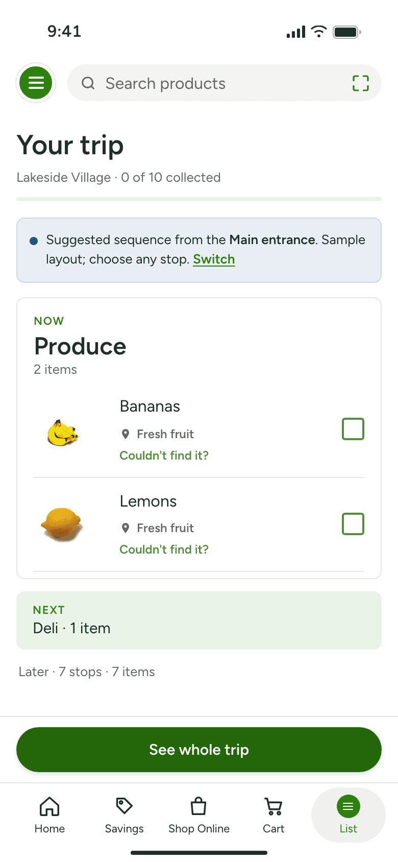
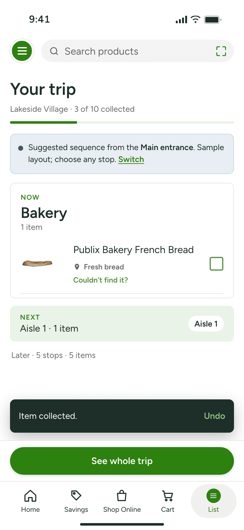
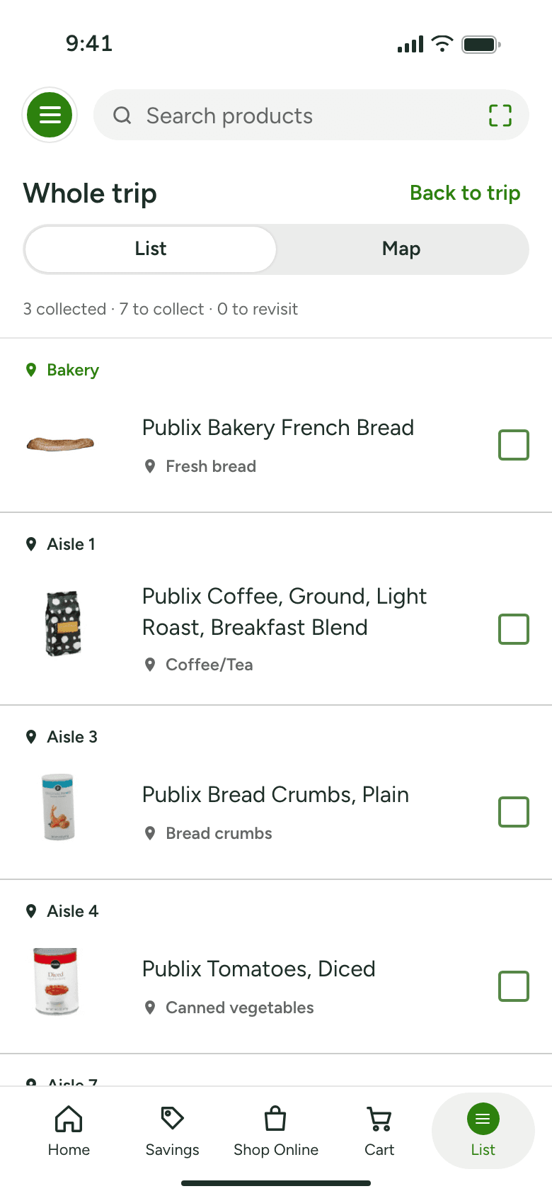
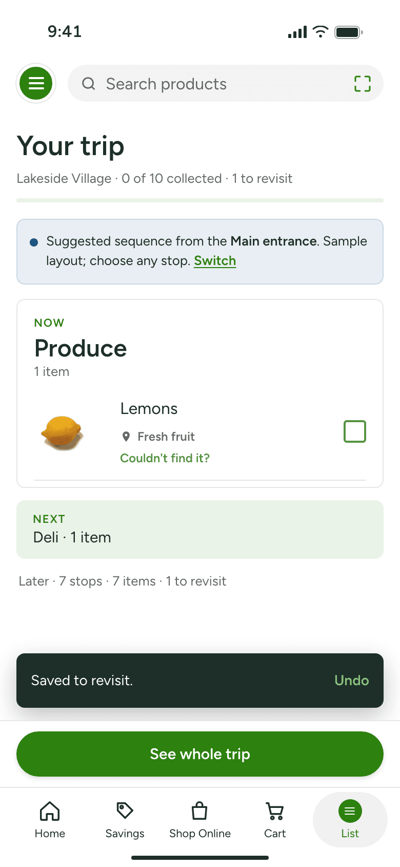
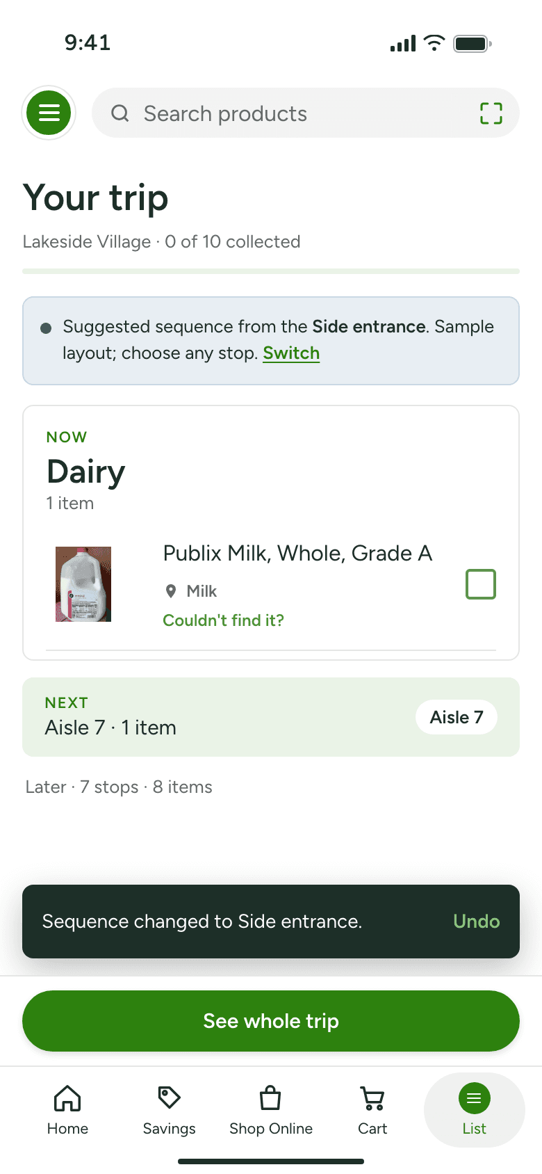
Same aisle groups, four presentations. Now, Next, Later gave focus without hiding the rest of the trip.
From the existing list to The Trip
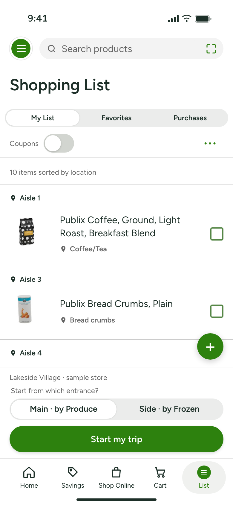
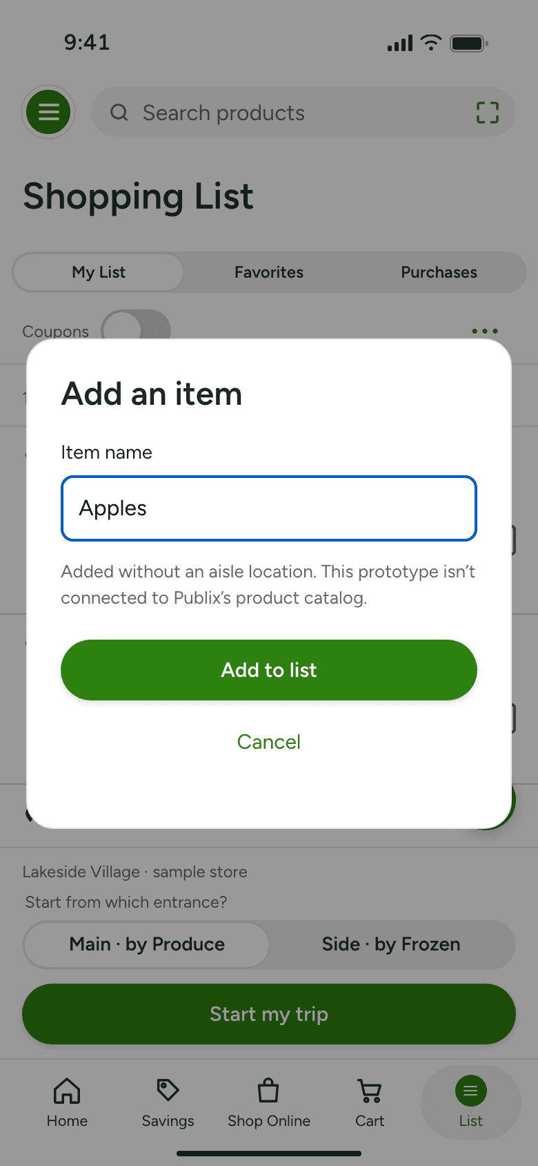
The Trip starts inside the existing list. Same rows, same aisle groups, same check-off, with Start my trip alongside an operable add-item control.
Every state, from the prototype
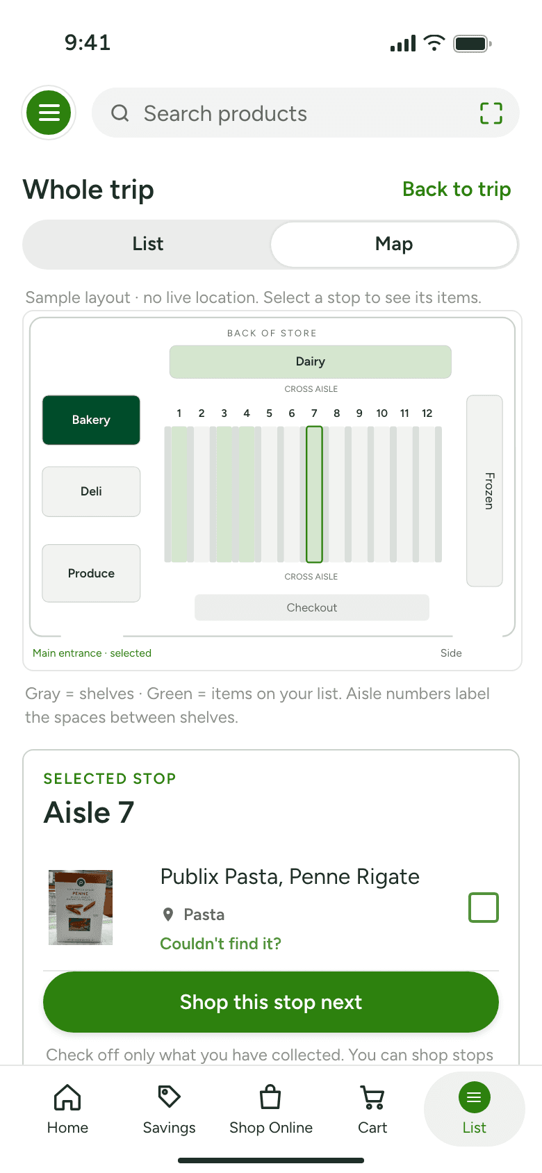
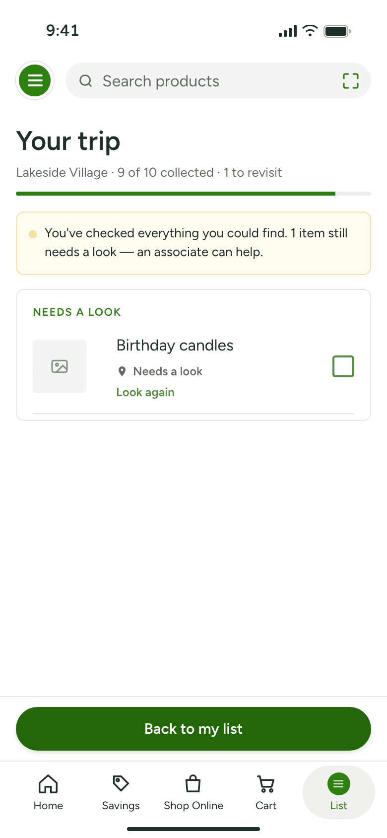
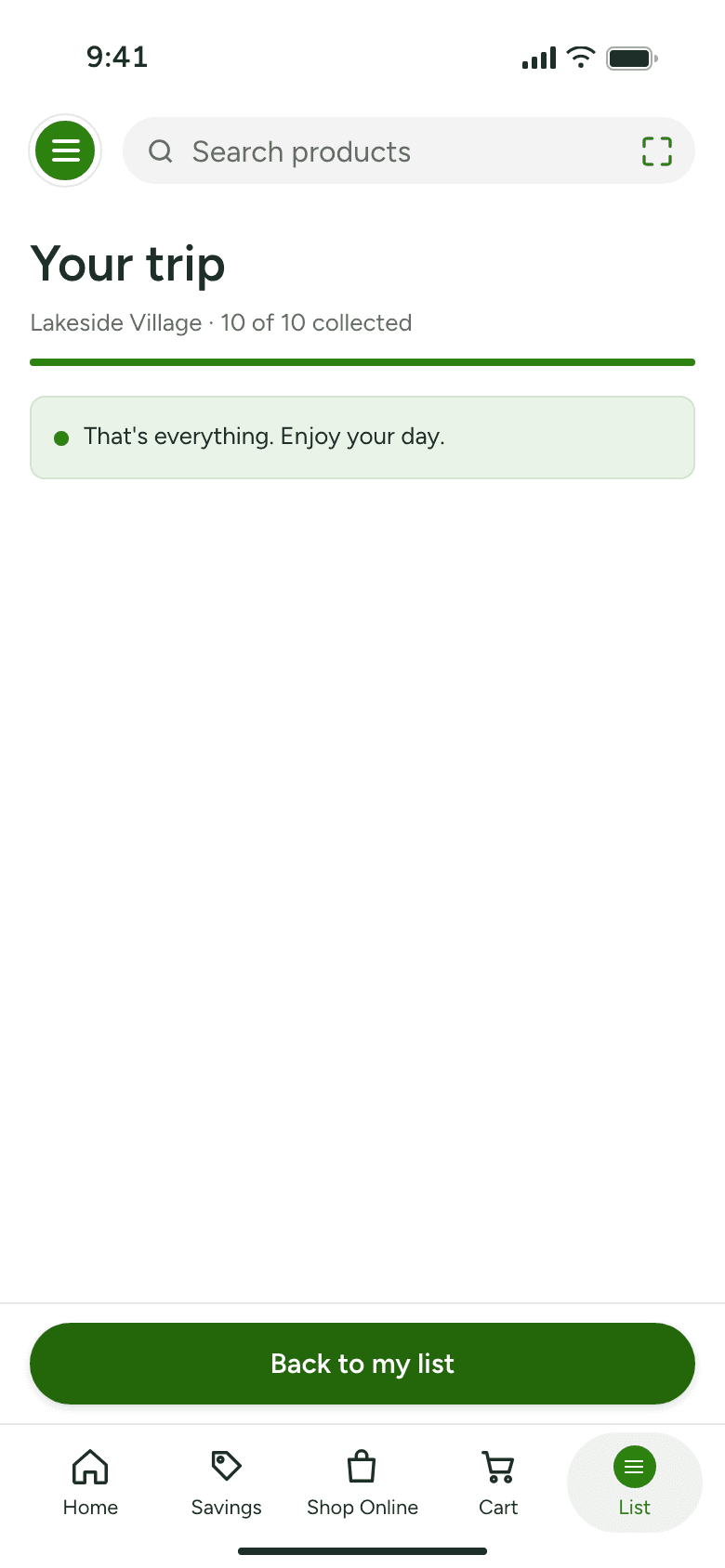
Captured from the current prototype. Explore progress, changes of plan, recovery, and completion.
In Publix's visual language
Product rows, location labels, green actions, and segmented controls follow Publix’s public iOS screenshots. Figtree stands in for the proprietary typeface; native pixel parity is unverified.
05 / Prototype
Try The Trip.
One sample store, ten items. Try changing course without losing progress.
1. Choose an entrance2. Collect or defer an item3. Choose another stop4. Undo a change
Interactive concept · sample data
Trip behavior is operable. Account, search, and other surrounding app controls are outside the prototype’s scope.
Live prototype. If the embed doesn’t load, open it in a new tab ↗.
What a clearer trip could change
- Less repeated scanning of the whole list.
- More control over the next useful stop.
- Fewer unresolved items lost from view.
Hypotheses, not measured outcomes.
What I would test first
Current list versus The Trip, with 5–7 Publix shoppers in one real store. Count rescans, time to name the next stop, and whether they get back to a deferred item.
No improvement, added navigation effort, or confusion about “to revisit” would challenge the hypothesis. A study this size finds usability problems; it does not establish time savings or business impact. Full plan in the notes below.
What changed my mind
The biggest change was not visual. It was learning to stop calling a mature feature a gap. Once it was undeniable that Publix already sorts by location, the concept had to earn its place somewhere smaller and more defensible.
Research notes and sources
Independent work by Dinesh Revunuru; not commissioned, approved, or endorsed by Publix. No Publix customer interviews, internal analytics, inventory feeds, or floor plans were used. Sources revisited September 5, 2026.
What other products informed the concept
Public product comparison · reviewed September 2026| Product | Evidence reviewed | Lesson for The Trip | Boundary |
|---|
| Publix [1][2] | Location groups, item photos, check-off; review praise for deals and clear lists. | Extend the current list and familiar product language. | Public references do not reveal every authenticated feature. |
|---|
| Walmart [6] | Store Mode connects a list with item finding, maps, and price checking. | Digital support can continue inside the store. | Exact walking-order mechanics were not established. |
|---|
| Kroger [7] | Store Mode documents a selected-store experience and finding items. | Store context belongs close to the shopping task. | Feature documentation does not prove customer preference. |
|---|
| Grocery-list apps [4][5] | Users describe encounter order, missed items, and ordering workarounds. | Give shoppers control over sequence and a clear remainder. | These reviewers are outside the Publix-specific sample. |
|---|
From evidence to design decisions
Source observation → interpretation → design use| Source observation | Interpretation | How it informed the concept |
|---|
| Publix already groups list items by location; one reviewer values this. [1][2][3] | Preserve useful structure. The list is a starting point, not a blank slate. | Keep product rows, aisle groups, and check-off. Add trip focus without replacing the list. |
|---|
| A 2021 Publix review requests aisle reordering; an adjacent-app reviewer describes walking order. [2][4] | Support shopper control. Display order may not fit an individual trip. | Suggest a sequence, retain whole-trip access, let the shopper select another stop. Entrance choice is an assumption to test. |
|---|
| An adjacent-app reviewer describes returning for an overlooked item. [5] | Keep unfinished work visible. This raises a recovery question; it does not prove a Publix not-found problem. | Explore To revisit and Undo as a recovery hypothesis. Never equate unresolved with collected or unavailable. |
|---|
Evaluation plan · proposed, not conducted
Formative study. Comparable 12–18 item tasks, order counterbalanced to reduce learning effects.
Evaluation questions and decision criteria| Question | Observe | Design response |
|---|
| Is the next stop clearer? | Time to identify a stop, list rescans, participant explanation. | Simplify the hierarchy if focus adds work. |
|---|
| Does the order help? | Direction reversals, missed items, trip time, manual overrides. | Reconsider sequence if shoppers consistently work around it. |
|---|
| Is the origin understandable? | Entrance recognition and confidence before seeing the map. | Revise or remove entrance choice if it confuses. |
|---|
| Is recovery honest and usable? | First action after a not-found item; revisit and completion comprehension. | Revise labels if unresolved reads as collected or unavailable. |
|---|
| Can people use it comfortably? | Task ease, one-handed use, screen-reader navigation, enlarged text. | Adjust interaction and density around observed barriers. |
|---|
Sources
- Publix · Shopping List FAQ ↗ — Existing aisle and area locations. Product documentation.
- Publix · App Store ↗ — Current product reference; August 2021 department-order review; positive deal and list feedback.
- Publix · Google Play ↗ — April 19, 2025 · 2/5 review; praises aisle grouping within a critical review.
- Out of · App Store review ↗ — April 16, 2025. A shopper describes arranging items in walking order.
- Shopping List · App Store reviews ↗ — May 2024 and June 2025. Backtracking and a workaround to preserve aisle order.
- Walmart · Store Mode ↗ — First-party in-store companion features.
- Kroger · Store Mode ↗ — First-party selected-store and item-location features.
Historical reviews are shown with their original dates; they do not establish the current prevalence of a problem. The store layout, entrances, item assignments, and suggested order are illustrative. Product imagery and app references explain the concept; publication rights require review before external release.