Streamlining Hiring Processes
with Intelligent Automation
Project overview
Headnxt! A leveraging Artificial Intelligence to simplify, automate, and enhance the recruitment process.
My role
UX UI Designer | Neudesic (an IBM Company)
User research, Information architecture, wireframing, visual design & usability testing.
Duration
May 2022- Mar 2023
(11 months)
Intro
HeadNXT is an AI-powered assistant designed to simplify, automate, and enhance the recruitment process. The tool helps with candidate sourcing, task recommendation, task automation, and reporting, aiming to make the recruitment process more efficient and effective. In the initial phase, when we started this initiative we doesn't have a name in mind, but we were focusing to learn on different resources and we technically or maybe research which we were doing are in parallel to HCAI, referred as human centred artificial intelligence. Headnxt project was aims to solve challenges in candidate recruitment process by building an application that will be widely used by the recruitment team and the human resources team in our current organisation. our primary users in head next initiative or and the users that we are building this product directly falls and uses in our current organisation.
Primary objectives
- Streamline and automate the recruitment process to save time and reduce manual effort for HR professionals.
- Improve candidate engagement and communication to reduce drop-out rates and enhance the candidate experience.
- Implement AI-driven solutions to enhance the accuracy and efficiency of candidate screening and matching.
- Provide comprehensive analytics and reporting tools to enable data-driven decision-making in recruitment.
Business goal
Create a scalable and sellable product that addresses the key pain points in recruitment and delivers significant value to HR teams and organisations.
Background and Initiative
The initiative's core purpose was to learn designing for AI as consultants in our current organisation, gain knowledge and insights, future-proof skills, and better serve clients. As we dug deeper in identifying handful of initial resources we found handful of resources worked by companies and organisations with HCAI defining principles, theories along with the kind of researches they have been working on.
This include researches, guidelines and toolkits from organisations like IBM, Microsoft, Google and Stanford Human centred AI.

A group of enthusiastic designers formed a team to explore AI principles and AI design language. Team members delved into various AI research by industry leaders like Google, Microsoft, and IBM. This include researches, guidelines and toolkits from organisations like IBM, Microsoft, Google and Stanford Human centred AI.
Discover
User Research
Secondary research
Identified gaps in the recruitment process through interviews and task analysis with current HR professionals. significant Problems Identified:
- Voluminous Candidate Filtering: Recruiters face a time-consuming and tedious process of filtering through numerous candidate applications.
- Duplication of Profiles: Frustration with the duplication of candidate profiles, complicating tracking and management.
- Data Gathering and Analysis: Difficulty in generating accurate and timely reports on candidate fitment and recruitment progress.
- Tracking Availability: Challenges in tracking the availability of panel members for interviews.
- Communication Delays: Inefficient communication between HR and candidates, leading to delays and potential drop-outs.
- Scheduling Challenges: Complications in scheduling interviews efficiently.
- Offer Letter Delays: High drop-out rates, with 50% of selected candidates who were offered a job ultimately not joining.
- Manual Rework: Repetitive and manual tasks in the recruitment process.
- Candidate Engagement: Keeping candidates engaged throughout the recruitment process to reduce drop-out rates.
- Lack of Data for AI Training: Insufficient data to effectively train AI models for better candidate matching and screening.

Recruiters face a long tedious process of filtering potential candidates
User Insights:
From discussions with focus user groups and analyzing past data:
– Recruiters spent hundreds of hours on recruitment activities, collecting 17,000 interviews.
– Half of the selected candidates who received job offers ultimately dropped out, highlighting a critical area for improvement.
Hypothesis:
- If candidate engagement is higher, then the chances of candidate drop-out will be significantly lower.
- If AI is used to filter candidate profiles efficiently, then the efforts of recruiters can be redirected towards identifying potential candidates rather than spending time on filtering, searching, verifying, and coordinating.
Primary research
Our primary research aimed to delve deeply into the pain points and daily challenges faced by HR professionals in the recruitment process. This phase was crucial for us to gather firsthand insights and validate our initial hypotheses. The research consisted of several key activities:
User Research Approach
We started with a clear research objective: to understand the inefficiencies and frustrations within the current recruitment process. The research was structured around conducting detailed user interviews and focus groups with HR professionals. Our methodology included both qualitative and quantitative approaches to ensure a comprehensive understanding of user needs.
Role and Responsibilities
As the lead researcher, I was responsible for the end-to-end management of the user research phase. This included:
- Planning and Scheduling: Coordinating with HR professionals to schedule interviews and focus group sessions at convenient times.
- Questionnaire Design: Crafting a set of well-thought-out questions aimed at uncovering deep insights into the user experience and pain points.
- Conducting Sessions: Facilitating the interviews and focus groups, ensuring a comfortable environment for participants to share openly.
- Data Analysis: Synthesizing the collected data to identify key themes, trends, and actionable insights.
Focus Group Sessions
We conducted multiple focus group sessions with HR teams to discuss their experiences, challenges, and expectations regarding the recruitment process. This collaborative environment allowed us to gather diverse perspectives and fostered rich discussions.

Recruiters face a long tedious process of filtering potential candidates
One-on-One Interviews
In addition to focus groups, we held in-depth one-on-one interviews to explore specific pain points in greater detail. These sessions provided a more personal view of individual experiences and frustrations.
Task Analysis
We observed HR professionals using their current tools and workflows to identify inefficiencies and areas for improvement. This hands-on approach helped us understand the practical challenges they face daily.
By meticulously analyzing the data from these sessions, we gained a profound understanding of the recruitment process’s shortcomings. These insights were pivotal in shaping our solution, ensuring it was grounded in real user needs and experiences.
User interviews
We have prepared a set of questions which acts as a reference so the interaction with the user doesn’t go in a weird way when interviewing users. We have prepared these questions in such a way that will be learning more things from the user in an interactive way by expressing their story and their pain points which they show me during this online journey. Experiences change from person to person so we have taken every user story the consideration.
we have prepared a set of questions for the user interviews. These questions allowed us to learn more about the user’s behavior and experience with clothes purchasing.
- What is your preferred method of shopping- online or in-store?
- Can you elaborate on why that is your preferred method?
- How long does it take for you to shop online?
- Do you think that you shop more/less because it is online?
- Which brand/website do you use the most to shop online?
- What is it about the brand that makes you go back to it?
- What are some features that you use when you shop online?
- What are some factors that you keep in mind when you shop online?
- Have you ever purchased something that you originally did not plan on because of the recommendations that the website offers?
- What is something that you find irritating about shopping online?
- Can you describe your most recent experience with shopping online?
- Can you describe what a positive online shopping experience would be like?
- Can you describe what a negative online shopping experience would be like?
- Do clothing brands actually matter to you?
- What brand fitting are you the most comfortable in? Would you choose any other fitting, if yes when?
- Do you think it is worth getting clothes tailored?
- What are the factors that are keeping you away from custom-tailored clothes?
- Would you like a stylist to design everything for you when you’re unsure what exactly you are looking for?
- Do you recommend brands/tailors you like to others? What motivates you to do so?
- What do you look for in a brand/tailor before deciding to buy?
we have prepared a set of questions for the user interviews. These questions allowed us to learn more about the user’s behavior and experience with clothes purchasing.
- I don’t give much importance to clothing until and unless there is an occasion on which I need to be present. Not the kind of person who purchases clothes very often. So I like to buy a good one.
- I prefer buying clothes online because I would be getting better prices compared to stores and I can see a wide variety of collections online.
- I buy clothes at stores because I give much importance to comfort where I can try and buy them.
- Most often I return back online purchased clothes due to fitting issues.
- I return clothes back to the online platform mostly due to the product being different from the image shown on the platform or the product has not met the description stated on the platform or didn’t reach my expectations.
- Few stores don’t accept clothes for alteration due to the brand guidelines. So I end up doing my alteration with a local tailor.
we have prepared a set of questions for the user interviews. These questions allowed us to learn more about the user’s behavior and experience with clothes purchasing.

Additional validation made out of secondary research
Stakeholder interview
We have interacted with the stakeholders and business advisors of unique fit to learn more about what is possible and what is not in the textile industry. We have gone through a lot of conversations with Uniquefit advisors from the perspective of business. We were very glad that the stakeholders of Uniquefit spent enough time to provide a better product for the users during the research stage.
Competitive analysis
Once we were able to get a better understanding of the thoughts and feelings of the users, we proceeded to conduct research on some of the direct and indirect competitors. During the research, we wrote down some of the major strengths and weaknesses of each of the websites. Doing so made us learn more about the companies who are working on this problem to offer users a better experience with purchasing clothes online and it easier to figure out the commonly sought-after features for fashion e-commerce websites.

A snap of competitive analysis data is shown above.
Define
Analysing data
Empathy map
As part of our comprehensive user research, we created an Empathy Map to capture the thoughts, feelings, and behaviours of HR professionals during the recruitment process. This tool helped us gain deeper insights into the emotional and psychological states of our users, allowing us to design solutions that truly resonate with their needs.
In our user research phase, the Empathy Map played a crucial role in understanding the holistic experience of HR professionals involved in recruitment. This map was developed based on data gathered from detailed interviews and focus group sessions. By focusing on four key areas—thinking, feeling, doing, and hearing—we were able to capture a nuanced picture of our users’ experiences.

User persona
we developed detailed personas to represent the key stakeholders involved in the recruitment process. These personas were crafted based on the data collected from interviews and focus group sessions with HR professionals, helping us to empathize with our users and tailor our solutions to their specific needs and behaviors.
During our user research, we identified distinct user personas that encapsulate the roles, responsibilities, and challenges faced by HR professionals in the recruitment process. These personas were derived from insights gathered through detailed user interactions, focusing on four key areas—demographics, goals, pain points, and behaviors.

User journey map
In our user research phase, the User Journey Map emerged as a vital tool to understand the holistic experience of HR professionals throughout the recruitment process. This map was created based on insights gathered from interviews and focus group discussions, highlighting key stages and interactions in the journey. The map focuses on four main phases—sourcing, screening, interviewing, and onboarding.
- Sourcing:
- Activities: HR professionals engage in job postings, candidate sourcing from various platforms, and initial outreach.
- Pain Points: Difficulty in attracting quality candidates and managing multiple sourcing channels.
- Opportunities: Implementing AI-driven tools to automate candidate sourcing and streamline initial outreach.
2. Screening:
- Activities: Reviewing resumes, conducting initial screenings, and shortlisting candidates for further evaluation.
- Pain Points: Time-consuming resume reviews and managing duplicate profiles complicate the process.
- Opportunities: Utilizing AI-powered resume screening to quickly identify top candidates and reduce manual effort.
3. Interviewing:
- Activities: Scheduling interviews, conducting interviews (both in-person and virtual), and collecting feedback from interview panels.
- Pain Points: Scheduling conflicts, communication delays, and ensuring timely feedback from panel members.
- Opportunities: Implementing smart scheduling tools and automated communication to streamline the interview process and ensure timely feedback.
4. Onboarding:
- Activities: Extending offers, completing documentation, and facilitating new hire orientation and training.
- Pain Points: Delays in offer acceptance, high drop-out rates, and managing onboarding logistics.
- Opportunities: Enhancing candidate engagement through automated follow-ups and providing a seamless onboarding experience with efficient documentation and training processes.
Emotional Journey:
Throughout these phases, the User Journey Map also captures the emotional experiences of HR professionals:
- Excitement: During the sourcing phase, there is excitement about attracting new talent.
- Frustration: Screening and scheduling can be frustrating due to the high volume of resumes and coordination challenges.
- Stress: Ensuring timely feedback and managing candidate drop-outs during the interviewing phase can be stressful.
- Satisfaction: Successfully onboarding a new hire brings a sense of accomplishment and satisfaction.

Synthesizing data
User stories

Hypothesis statements

Ideate
User flow
With the problem statement in mind, we developed a task flow to show the ideal flow that the user would take to complete a task on Uniquefit website. In this particular case, it focused on finding and purchasing a product from the website. We have took a scenario in which user would have already signed up with the application. Working on this helped me identify the key screens for my design.

Picture of crazy 8's I have done during the process.
Updated User flow
With the problem statement in mind, we developed a task flow to show the ideal flow that the user would take to complete a task on Uniquefit website. In this particular case, it focused on finding and purchasing a product from the website. We have took a scenario in which user would have already signed up with the application. Working on this helped me identify the key screens for my design.

Picture of crazy 8's I have done during the process.
Card sorting & IA
With the problem statement in mind, we developed a task flow to show the ideal flow that the user would take to complete a task on Uniquefit website. In this particular case, it focused on finding and purchasing a product from the website. We have took a scenario in which user would have already signed up with the application. Working on this helped me identify the key screens for my design.
Picture of crazy 8's I have done during the process.
Wireframing
Low-Fidelity wireframes
With the bunch of ideas, we explored as a team has come up with different wireframes representing the ideas we have come up with in the brainstorming session. We have tested as many ideas as possible and collected every possible feedback. Below are a few of the ideas we have worked on.
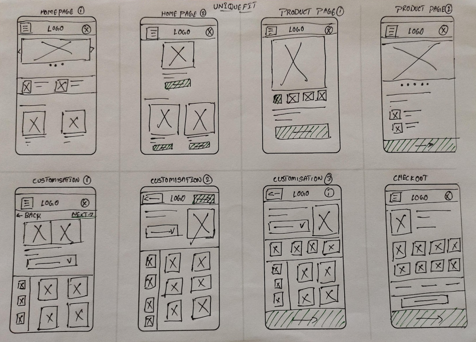
Mobile application paper wireframes are used for ideation and for better product designing.
Since we have followed mobile first approach we have given everything first priority for mobile followed by the web application. This made our work go really smooth. Working on all the requirements for a smaller screen gave us breath taking time when we were designing a larger screen.
Above are the paper wireframes built for the web application.
Design
High-Fidelity wireframes
Secondary research gave us a valuable starting point, however I wanted to conduct primary user research to really delve into the daily work life of a freelancer.
For a deeper understanding of freelance needs and challenges, we recruited and conducted a user interview in order to learn about freelance attitudes towards, and management of, non-billable tasks. Because this interview presented a small, non-representative sample, I also conducted a user survey to collect additional data.
The goal of my research was to better understand the experience and feelings of freelancers when completing non-billable tasks. Key insights from my discovery research include:
Customization tool for users
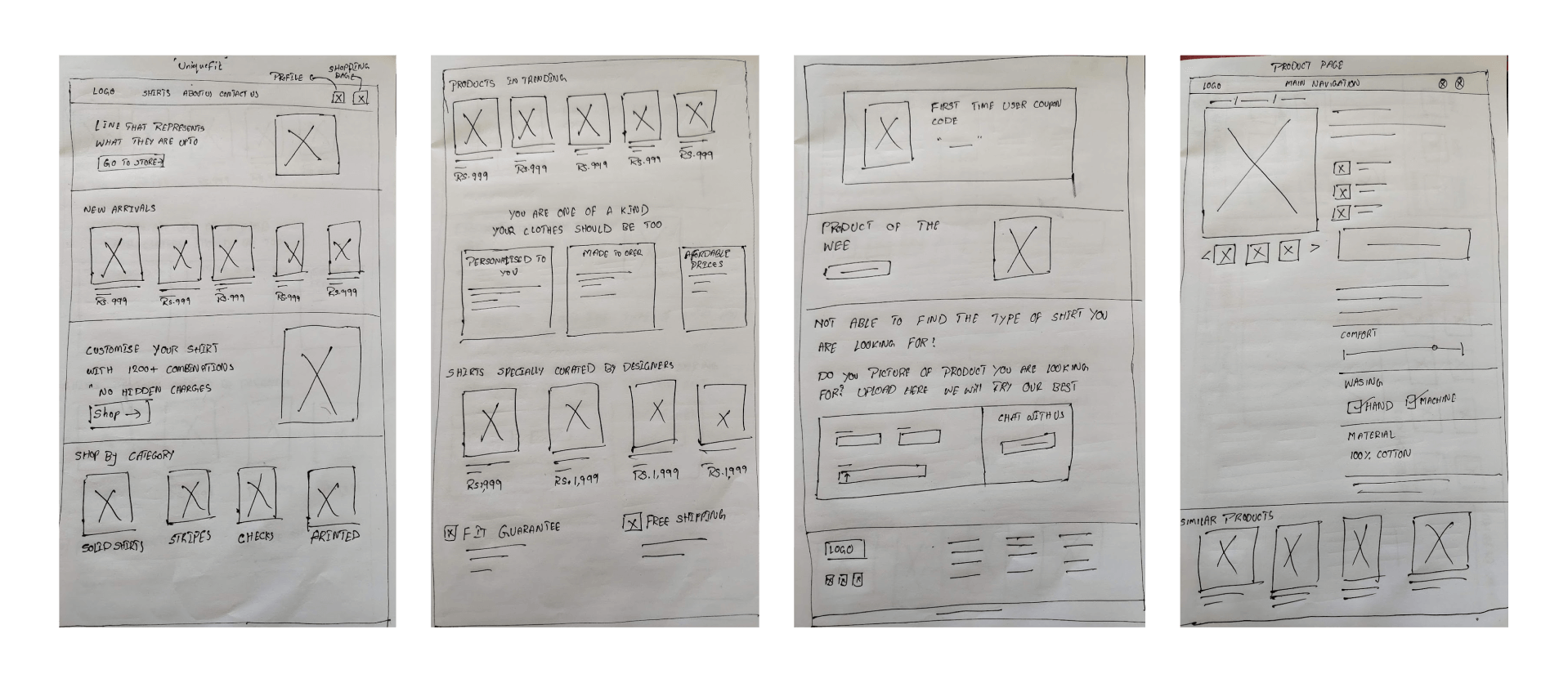
Here comes the important and difficult challenge for us which is designing user-friendly dashboards to customize their shirts. We have done a lot of research to understand how users are interacting and performing tasks on the competitor’s sites. We have collected a good amount of information to proceed further.
During this process we have designed a style customization layout below can be seen. Who have built this rough wireframe from the understanding of the business perspective and the story we heard from the stakeholders of uniquefit, for a better understanding of where we are heading to.
Above are the paper wireframes built for the web application.
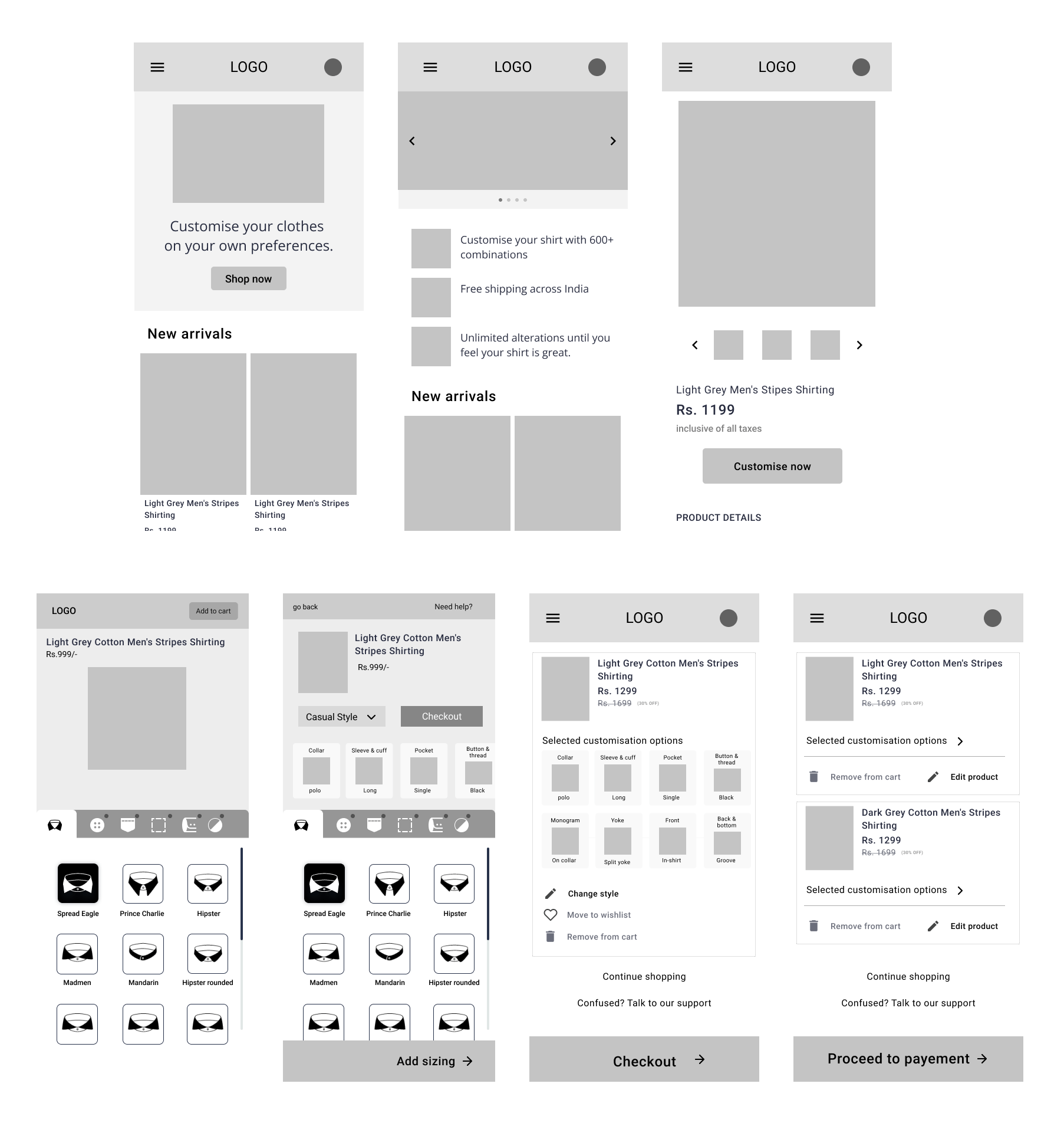
We have designed and developed a high-fidelity prototype and tested it with a few people (which includes stakeholders, project managers, designers not working on the project, and developers) who can understand the technical side of the wireframes.
Later in this part, we observed users interacting with high-fidelity prototypes. During this stage, we felt that there was a lot of cognitive load on the users while going through the process of selecting the styles they desire. Which is making users get frustrated and exit the dashboard. We have also observed that users are confused and left in a state of not knowing what to do next.
We have a design plan to reduce cognitive load by showing the selections that users have selected between the style variations. We aren’t practically sure which customization layout would allow users to the maximum and best usable way. So, we decided to test out all three possible layouts by testing prototypes with the users.
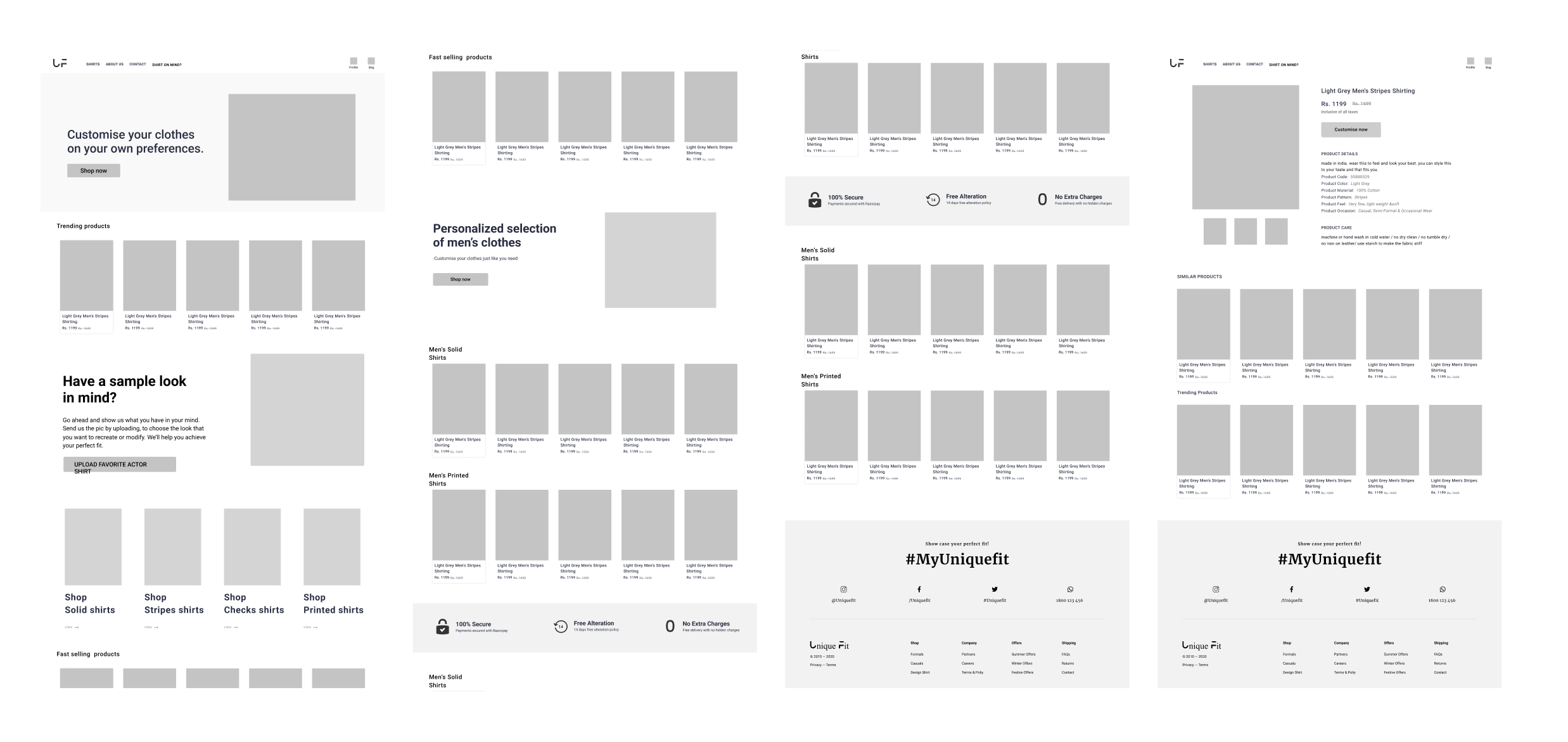
Visual design
We have a design plan to reduce cognitive load by showing the selections that users have selected between the style variations. We aren’t practically sure which customization layout would allow users to the maximum and best usable way. So, we decided to test out all three possible layouts by testing prototypes with the users.

UI design & prototyping
We ideated in collaboration on what the new Information architecture of the platform should look like, ensuring that it is usable and scalable.
For proper hands-on collaboration and to provide real-time visibility of progress to the stakeholders we chose Figma as our design tool. All stakeholders were invited to that space, and feedback were taken from them. Figma was a lifesaver in this project as it enabled us to design things that were technologically feasible – since time was a constraint.
Complete usability testing was done at every stage. We employed the focus groups technique and user observation at each stage.
Web landing page and product page prototype
We tried to keep the platform as minimal as possible so that users feel easy to explore and reach their desired page or fulfill their task.
Providing a good user experience on the small screen is definitely a huge task for us. We have designed every small thing keeping mobile devices in mind. Mobile devices has reach to an extent that most of the users are trying to or performing their tasks on their mobile phone straight out of their pocket. We have also observed that our users preferred to explore the application through their mobile phones.
During the research I have asked other participants on which type of device they find new things or applications or what ever first talk. Majority of the people said that they find new things on their mobile first either in the form of social media post or through a text message from Friends and colleagues or casual web surfing. The thing people do when they find something new on their mobile is to check it out straight away on their mobile browser.
So the type of application we are designing now need a lot of good user experience on a mobile platform.
Mobile landing page and product page prototype
We took good care when designing mobile screens. We have conducted usability studies after designing every screen to make sure everything goes well for from the perspective of users. Readability and finding the right options quickly is our highest priority when designing for a mobile screen.
You have to design the complete UI of all three layouts of the style customization dashboard just like I have said to you during the high-fidelity wireframes of this above article. We have decided to pick one final layout by conducting a usability test and collecting user feedback.
This is something like leaving out the choice for the people. 😅
Usability testing
We have conducted an unmoderated remote usability study which lasted for four days. During this usability study, our highest priority was to learn more about how users interact with the customization dashboard. The customization dashboard is the complex structure in this application where different types of people will be using it which includes both technical and non-technical people in the sense of people who are new on the internet. Our main aim is to make this style customization dashboard as simple as possible for the user as well as to maintain a good conversion rate for the users.
During this usability study we have asked users to perform a set of tasks. While performing the assigned task we have calculated the time took by the user to perform the task, error rate, drop-off rate, conversion rate and at the end SUS followed by Net promoter score. We have recorded the whole session that has happened.
First let us finalise the customisation dashboard layout based on the results we have obtained from the study.
We have developed the above screens, which show the heat maps, user eye tracking, and repeated path to perform a task, based on our observations, studies, and feedback given by the participants from the usability study.
At the end, we have to pick layout-3 based on the studies, observations, and feedback from the user. We have seen that this one layout has a lesser error rate, less drop-off rate, and a high conversion rate.
Time taken for users to complete the task on the layout-3 is impressive. We think we have achieved because of the visual perception laws like the law of common region and the law of proximity is working really well.
But few technical people gave feedback that they are more comfortable with layout- 1. Here we have noted a saying in UX “What people actually say is not what they wanted“.
This is something like leaving out the choice for the people. 😅
cannot put the insights and metrics we have obtained ih the usability study.
Product page to style
customization dashboard prototype
We have kept our highest priority to help the users need their desired task with ease. We wanted to control drop-off rate, error rate and increase the conversion rate. So to provide assistance to people we made few changes to the dashboard after we have conducted the usability study.
Product page to style customization dashboard prototype
Who have tested out many designs to find out which one fits for the user. So we decided to design in this way so that miss touches can be avoided when user is trying to select a style. We have placed the CTA button at the top so that user may not hit the button by mistake. All the style options are placed with a one-hand accessible region.
Bag screen to checkout screen interactive prototype
Check out screen is a different kind of challenge for us. Users sometimes add the product to the bag or cart and come back later to purchase it. Users cannot remember all the options they have selected while customising a shirt. So, we have to show them a preview of selection of both style and size they have selected, option to preview and edit at checkout page.
Priority revisions
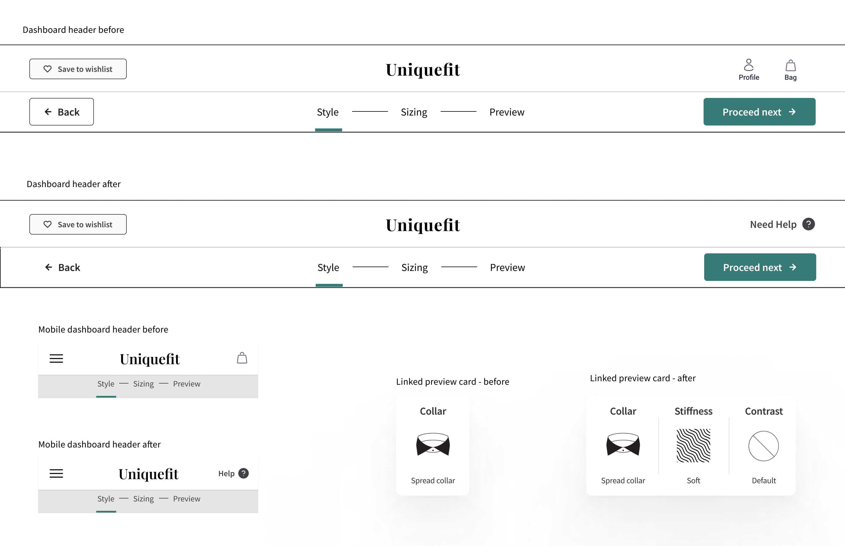
After a usability study, we have found users go missing or helpless during the process of customizing their shirts. So we have to design a customer support experience that can provide help to the user to make they should get right.
We have made changes to the dashboard of both web and mobile. We have to replace the profile and bag icons with help text and make a clear section at the left side of the head to make things more clearer to the user.
Developer Handoff
Once after all the process is done we have handed over the file to the developers and explain that tool and how to utilise the assets. I have also made a detailed documentation of the major components which are repeated across the application. Below is the sample documentation of the handoff file to the developers. We have trained developers with the Figma design file and using it. We have provided support to the developers for a certain period of time.
Disclaimer
This product is yet to be made accessible to general public. On my request client has accepted to publish this article and instructed me to not reveal sensitive information. Client and as well as Maxcreepers studio has verified this case study. Uniquefit team is happy to hear feedback from you. Please write to uniquefitindiaorg@gmail.com.
Thanks to Uniquefit CEO, Mr. Bharath kumar and Max studio team.