A B2B Platform for
Brands and Resellers
Project overview
B2B dock is a Bangalore-based startup working on a SaaS application providing Brands, resellers, and retailers a platform to trade commodities and other goods. B2B wants to solve the problems being faced by people in the unorganized sector by eliminating middle men.
My role
Product Designer
User research, Information architecture, wireframing, visual design & usability testing.
Duration
Jun-Oct 2019,
(5 months)
Client

Intro
Project overview
B2B Dock is a B2B e-commerce company that aims to simplify the trading experience for businesses. With a focus on creating a user-friendly platform, B2B Dock connects manufacturers, wholesalers, traders, and retailers, streamlining the process of sourcing products, managing inventory, and fulfilling orders. The platform offers a range of products across various categories such as fashion, electronics, home and kitchen, and more, making it a one-stop shop for businesses to meet their procurement needs.
B2B Dock's UI/UX design plays a critical role in creating a seamless and intuitive trading experience for its users. The design team is constantly working to improve the platform's usability, functionality, and aesthetics, with a focus on delivering a delightful user experience. By understanding the needs and preferences of its users, B2B Dock's design team creates a design language that is consistent, responsive, and easy to navigate, enhancing the platform's usability and accessibility. With a strong focus on UI/UX design, B2B Dock is well-positioned to continue its growth and success in the B2B e-commerce market.
Business goals
Enhance customer satisfaction: Customer satisfaction is crucial for any business, and B2B Dock is no exception. A user-friendly UI/UX design can improve the overall customer experience, resulting in higher customer satisfaction, increased loyalty, and repeat business.
Increase brand recognition: A well-designed UI/UX can also help increase brand recognition and awareness. By creating a consistent and recognizable design language across all touchpoints, B2B Dock can establish a strong brand identity, making it easier for customers to remember and recognize the brand.
Reduce customer support inquiries: An intuitive UI/UX design can also help reduce customer support inquiries by making it easier for customers to find what they need and complete tasks on their own. By reducing the number of support inquiries, B2B Dock can save time and resources, allowing the team to focus on other key business goals.
Design process

The Lean UX methodology has played a significant role in the UI/UX design of our company application. By focusing on user needs and constantly iterating based on feedback, we have been able to create a design that is both intuitive and user-friendly. The Lean UX approach has allowed us to design and test quickly, which has resulted in a more efficient and effective design process. Through our use of this methodology, we have been able to create a design that meets the needs of our users while aligning with our business goals. Ultimately, the Lean UX approach has allowed us to create a user-centric design that has led to increased engagement and satisfaction among our users.
User Research
Potential users
B2B Dock’s potential customers are small and medium-sized businesses across India. These businesses operate in a variety of industries, including manufacturing, retail, and wholesale. B2B Dock caters to businesses of all sizes, offering a range of products and services to meet their needs. B2B Dock’s target customers are looking for an efficient and convenient way to source products, access financing, and logistics services, and build relationships with their partners. By providing a one-stop shop for all their needs, B2B Dock is able to meet the needs of a wide range of customers, from small startups to large enterprises.
Competitive analysis
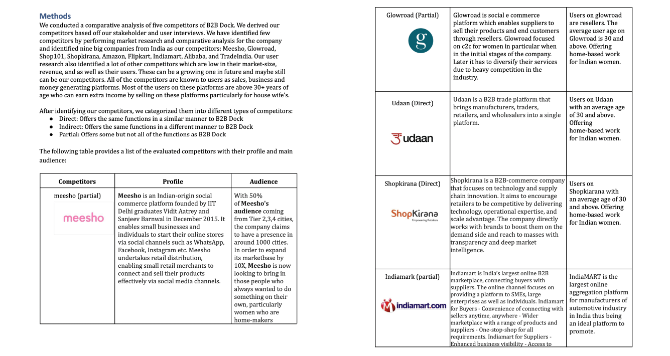
Once we were able to get a better understanding of the thoughts and feelings of the users, we proceeded to conduct research on some of the direct and indirect competitors. During the research, we wrote down some of the major strengths and weaknesses of each of the websites. B2B Dock is competing with a number of B2B e-commerce platforms in India. Some of the key players in the market include Meesho, Glowroad, Udaan, ShopKirana, Indiamart, TradeIndia, Alibaba, and Amazon Business.

A snap of competitive analysis data is shown above.
Wireframing
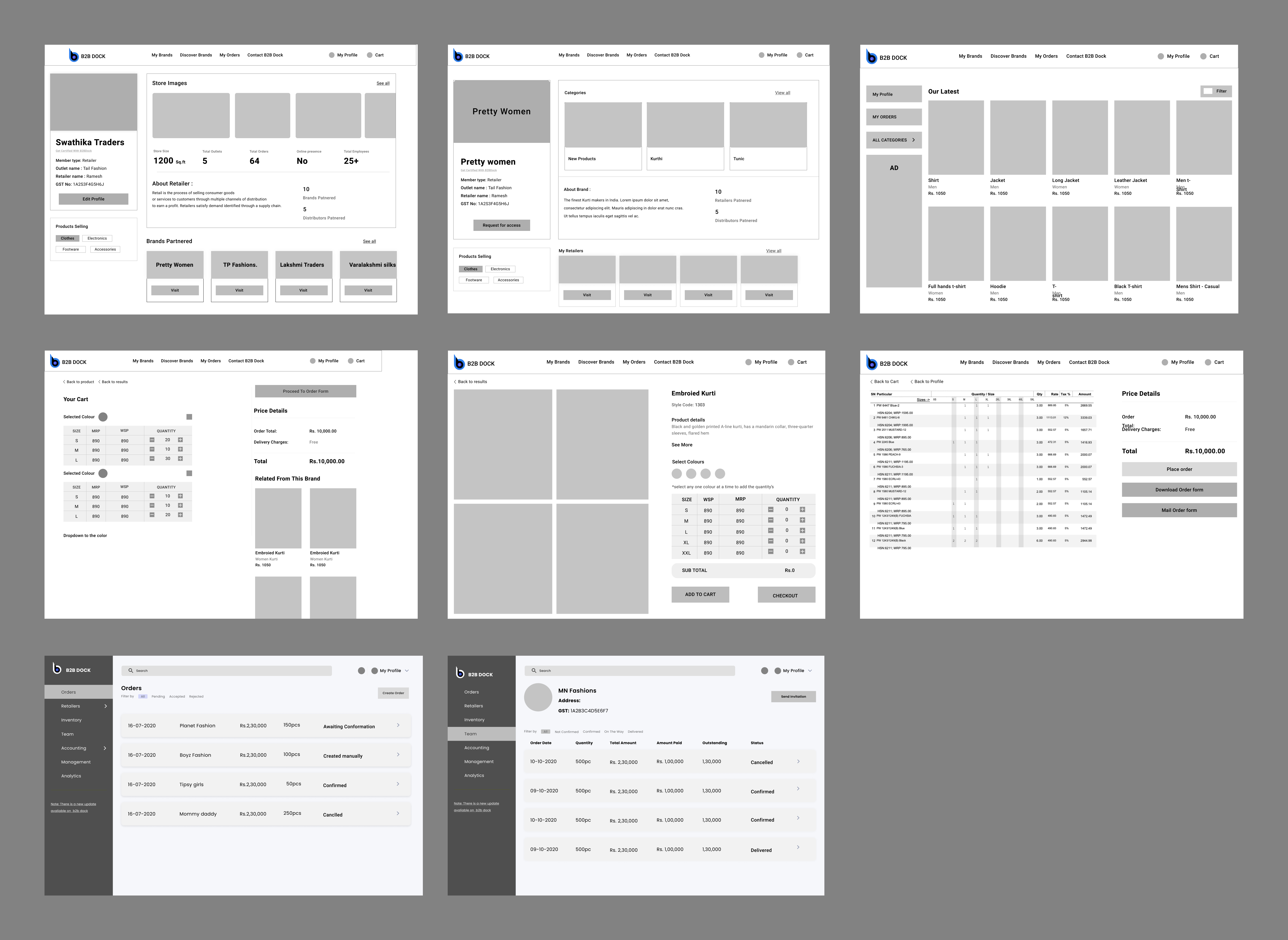
High-Fidelity wireframes
Secondary research gave us a valuable starting point, however I wanted to conduct primary user research to really delve into the daily work life of a freelancer.
For a deeper understanding of freelance needs and challenges, we recruited and conducted a user interview in order to learn about freelance attitudes towards, and management of, non-billable tasks. Because this interview presented a small, non-representative sample, I also conducted a user survey to collect additional data.
The goal of my research was to better understand the experience and feelings of freelancers when completing non-billable tasks. Key insights from my discovery research include:

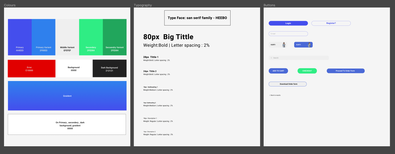
Visual design
We have a design plan to reduce cognitive load by showing the selections that users have selected between the style variations. We aren’t practically sure which customization layout would allow users to the maximum and best usable way. So, we decided to test out all three possible layouts by testing prototypes with the users.

UI design & prototyping
We ideated in collaboration on what the new Information architecture of the platform should look like, ensuring that it is usable and scalable.
For proper hands-on collaboration and to provide real-time visibility of progress to the stakeholders we chose Figma as our design tool. All stakeholders were invited to that space, and feedback were taken from them. Figma was a lifesaver in this project as it enabled us to design things that were technologically feasible – since time was a constraint.
Complete usability testing was done at every stage. We employed the focus groups technique and user observation at each stage.
Searching Brands and requesting content access.
We tried to keep the platform as minimal as possible so that users feel easy to explore and reach their desired page or fulfill their task.
Brands store visits and access products.
We tried to keep the platform as minimal as possible so that users feel easy to explore and reach their desired page or fulfill their task.
Applying filters on the brand's store.
We tried to keep the platform as minimal as possible so that users feel easy to explore and reach their desired page or fulfill their task.
Product selecting and checkout pages
We tried to keep the platform as minimal as possible so that users feel easy to explore and reach their desired page or fulfill their task.
Reseller profile editing and requesting for verification
We tried to keep the platform as minimal as possible so that users feel easy to explore and reach their desired page or fulfill their task.
B2B dock Brand's dashboard prototype
We tried to keep the platform as minimal as possible so that users feel easy to explore and reach their desired page or fulfill their task.
brand dashboard accessing marketing tool and Ad management
We tried to keep the platform as minimal as possible so that users feel easy to explore and reach their desired page or fulfill their task.
